The Modernism of Mexican Railways
Brilliant designs in the face of decline, and a complicated future.
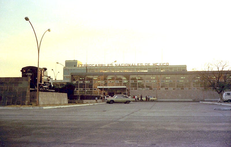
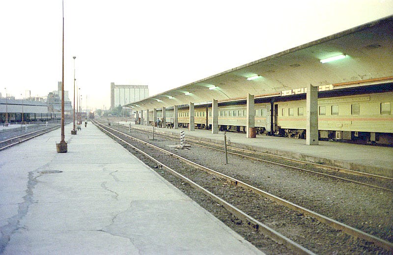
Mexico’s railway history is often overlooked, which is a real shame. Its story is no less interesting, and equally complex, as that of Canada or the US. In 1950’s and 60’s, when Mexico was rapidly growing and urbanizing there was an optimism that was reflected in the remarkably strong modernist design movement that was seen in all types of buildings. Even in the face of a growing economic and societal change which was going to ultimately doom passenger rail, railway stations were built as though the industry would always be around. In this relatively brief period Mexico managed to produce what are perhaps the best modernist railway stations anywhere in North America.
Despite several successes, the design culture within the railway sector never really had a chance to develop into something more mature. There are glimpses of where it was going, seen in some of the graphic design and urban public transport of the era. But by the end of the 60’s it was largely about surviving. By the 80’s, as a globalizing world that was increasingly focused on free trade deals rapidly expanded, Mexico would find itself under pressure to liberalize and de-nationalize pretty much everything. In the 90’s its railway sector succumbed to those forces and was privatized, with passenger service ending in 1997, though that would not be the end of the story.
This is far from a comprehensive look at the the story of modern Mexican railway design culture. So much more research and work could be done to really unearth all the hidden gems and stories that are waiting to be seen and told. But as a new era of rail service is set to begin in Mexico, with its own challenges, and being impacted by new social changes, it is instructive to see what traditions, and past design culture, it is building upon.
A growing and urbanizing Mexico
Mexico City was not always the massive urban agglomeration that it is today. In 1930 the population of the city was just 1,029,000, with a tidal wave of change just around the corner. By 1950 the city had grown to 3,136,000 people and over the course of just a 20 year period the population had risen to 9,045,000, by 1970. The growth wasn’t just limited to Mexico City with the country as a whole seeing its population skyrocket, alongside more and more people leaving the countryside and heading into the cities. The demographic shift meant that cities needed more buildings, and better transportation networks to move people around.
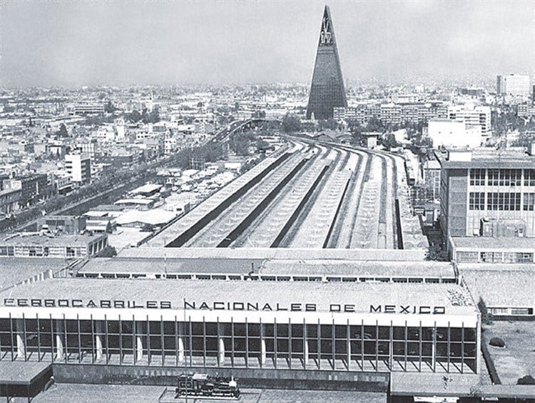
A birds eye view of Buenavista Station in Mexico City. The iconic Torre Insignia in the background, which was started in 1958 and completed in 1962. The picture hints at a city that was once relatively small in scale changing before for peoples eyes into a metropolis with larger, grander buildings, and increased connections to the rest of the country (and to the rest of the world). Image via La Silla Rota.
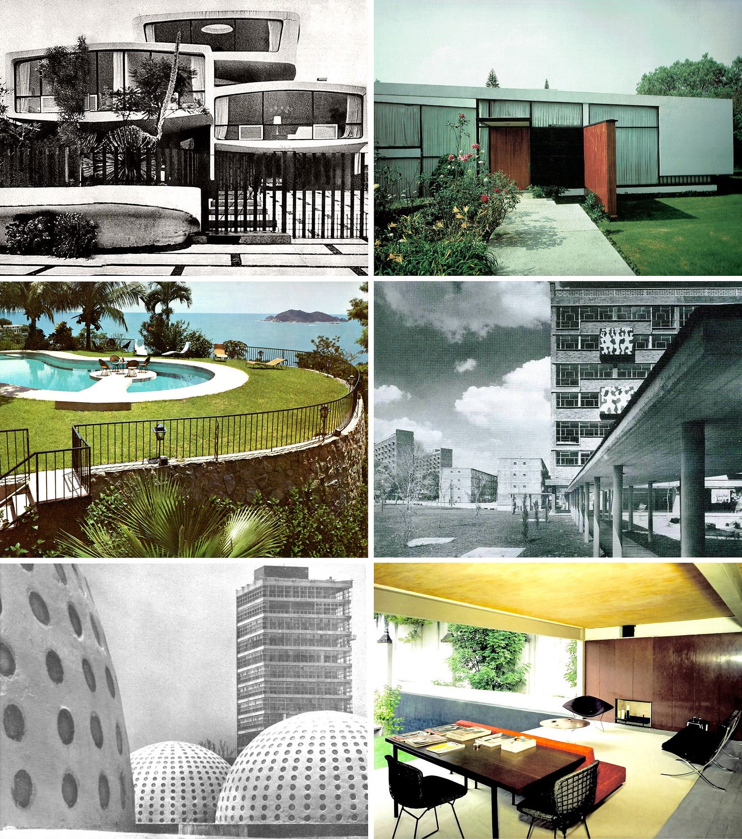
When it came to urban design, Mexico had already started to embrace the international style of the modernist movement in the 1940’s. Of course there are some absolutely banger examples of work that was done in Mexico, in particular in Mexico City, for the wealthy segments of society. But it would eventually have an impact on more modest and working class forms of housing and work places as well.
Mexico City in the 50’s and 60’s was a trad’s nightmare. Modernism was everywhere and once they started to blend in Mexican culture with the design philosophy it really took on a remarkable, and very humanistic, life of its own. Images via Una Vida Moderna.
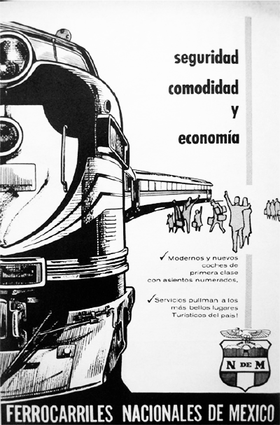
From the 1930’s up until the late 50’s/early 60’s, most of the design culture among Mexican Railways appears to have been rather conservative. It was not without its own charm and was reflective of Mexican culture. But functional was fine. As the railway was largely nationalized, unlike those in Canada and the US, there was no real need to attract and woo customers away from competing passenger rail companies with the latest trains and big, bold advertising.
Print ad from around the 1950’s for one of N de M’s train services. Via Archvio Sofree on Twitter.
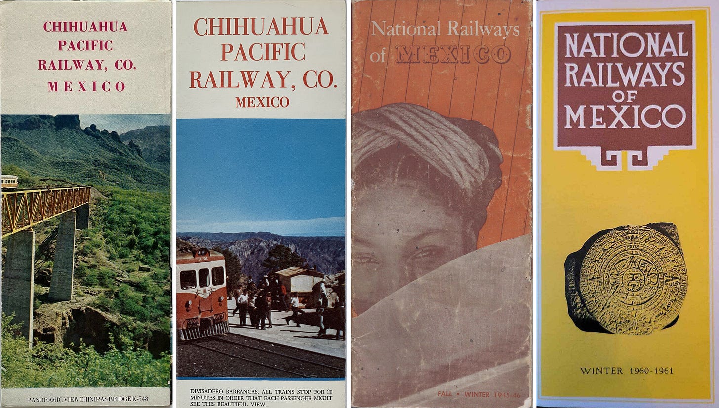
A collection of timetable and brochure covers from both N de M and the smaller Chihuahua Pacific Railways Company. With N de M there was a tendency for symbols, people, and bold colours to dominate the design aesthetic while the Chihuahua Pacific Railway put the scenery and landscape along its route on full display.
The logo for N de M which may go back as far as 1908, and lasted well into the 1960’s. Image from N de M brochure from Streamliner Memories.
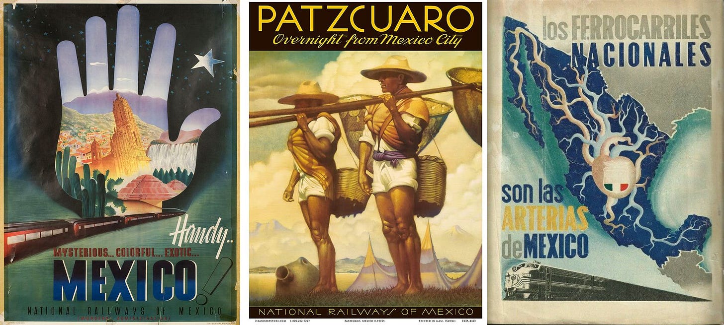
Some of the posters that were produced had a very similar aesthetic and sensibility to what was being done in Canada and particularly the US at the time. They did not shy away from bold colour palettes and patriotic images, with the train more often than not being a secondary character.
Three undated posters for the National Railways of Mexico. The first two are in English and would have been targeted to an American market, while the third was very clearly for Mexicans with the slogan on it translating into “The National Railways are the arteries of Mexico”. Left image via Pinterest. Middle image via Amazon. Right image via Pinterest.
There was a brief flirtation with the Art Deco style, with at least one station, in San Luis Potosí, built during that time. The station has been preserved and was turned into a railway museum in 2007, a decade after passenger service ended. There may be more examples of Art Deco stations or graphic design work. But owing to lack of archival information, and long abandoned stations perhaps simply being destroyed, they are very difficult to find.
Former railway station in San Luis Potosí, now a railway museum, and one of the few (perhaps only) built in the Art Deco style. Image by Lynx Burgos from WikiCommons.
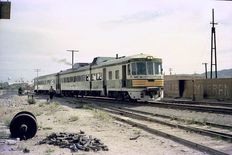
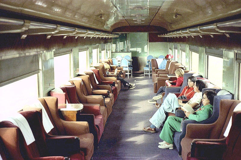
The trains themselves were nothing exciting. The carriages were often quite old, and some passenger services even used second hand locomotives that came from CN in Canada. When it came to long distance trains there was never the same, albeit limited, attempt at modernization in the 60’s and 70’s that was seen elsewhere in North America. Among the most interesting were those used on the Chihuahua Pacific Railway which had a strong Eastern European feel. This is not the only part of the Mexican railway that would feel as though it was inspired from outside of the Americas.
Local self-powered Chihuahua-bound train in Ciudad Juarez, Mexico in April, 1975. This train would have been right at home in Czechoslovakia or Yugoslavia. Image from View Of The Blue.
The interior of one of the FCP Club Cars. Not only is the carriage itself likely from the 30’s at best, but the chairs, which were no doubt very comfy, appear to have simply been taken from a living room set and put into a passenger car. Image taken on 30 December 1975 from View Of The Blue.
However by the late 1950’s there would be an attempt to shift Mexican railways into a bolder, more modern future. While it was ultimately just tilting at windmills, it produced some pretty remarkable results.
The modern era: From the late 1950’s to the late 1960’s.
The precise point in which the modernist era of Mexican railways began, and ended, is hard too pin down. There may have been some modernist stations built in the late 1940’s or early 1950’s. With a lot of information missing, and photos more often than not undated, it is hard to know for sure. The earliest confirmed date for the opening of a modern station was 1959. However a small station in Sanchez Islas, which is far more modest than anything else that will be discussed, could have been constructed a few years before that.
Sanchez Islas station with a late 1950’s station wagon being used as a track vehicle. Image from Fundacion Ferrocarriles De Baja California.
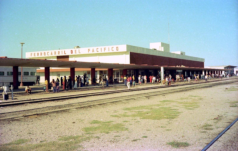
Most of the stations from the modernist era are actually relatively large in scale. In some cases this was owing to the fact that they were terminal stations, often times at towns next to the US border. But even those along the middle sections of the line were large enough that they could accommodate sizeable crowds of people disembarking and boarding. Because these were serving long distance trains that could sometimes take a full day to complete their trip, and often aiming for a more upscale market, lots of room for luggage was a big consideration in their design.
The Ferrocarril del Pacifico (FCP) station at Mazatlan taken on 30 December 1975. The photo doesn’t really show off the design of the station, but the people waiting around for the next train do give a sense of the scale of the building itself. Image from View Of The Blue.
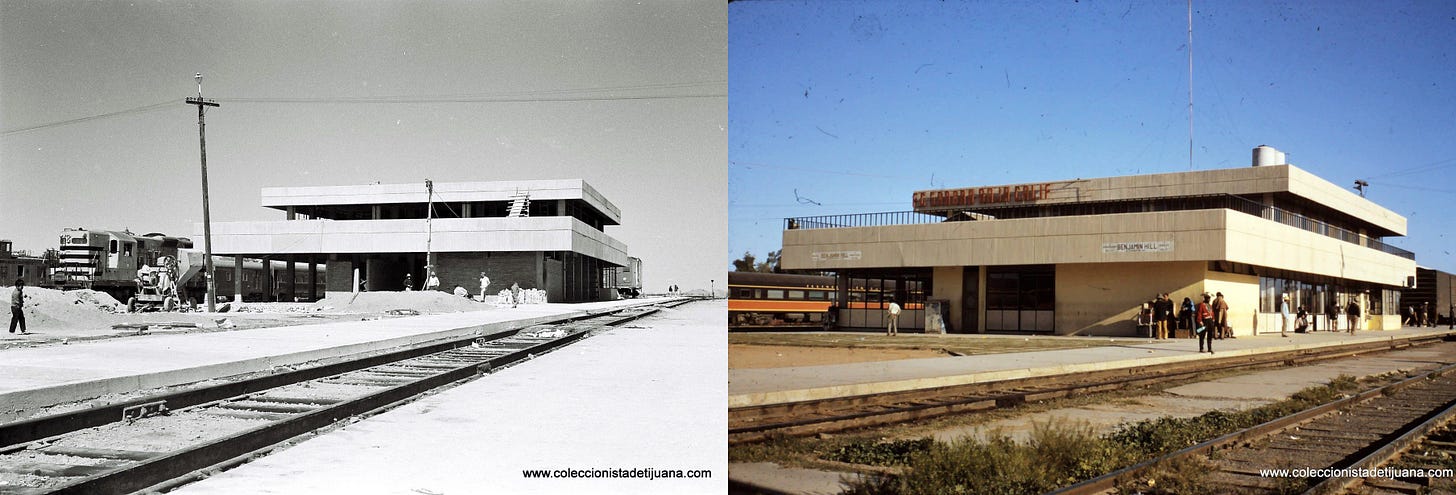
On the left is Benjamin Hill station under construction and on the right is after it had been completed and was in regular use. It is uncertain if the second level is also for passengers, or if it is used by staff for the freight railway operations (offices for the freight divisions would sometimes be built into the station complex). Image from Fundacion Ferrocarriles De Baja California.
Stations at the various border towns are quite interesting as they were very much built for a specific market. Because little, if any, of Mexico’s passenger rail services actually crossed the border into the US, this required passengers to enter Mexico by car (or by foot if an American railway station was close enough) and then boarding from the terminal station. Often times there were upscale services with fancy dining, sleeper and observation cars. And up until the mid- to late-60’s if you wanted to get to Mexico City or explore the Baja California region, the train was the only real option for those that could afford a comfortable experience, but couldn’t afford the still incredibly expensive prices to fly on an airplane.
The impact as a result of this customer market was that border towns often had large, flagship stations that were designed to appeal to upscale passengers. There was plenty of space in their waiting rooms, and they would have had all the amenities a “discerning” passenger would have needed during a wait that could have been a few hours long. Trains did accommodate second class passengers, primarily people living in the Mexican towns themselves, but they were not the primary focus of the services.
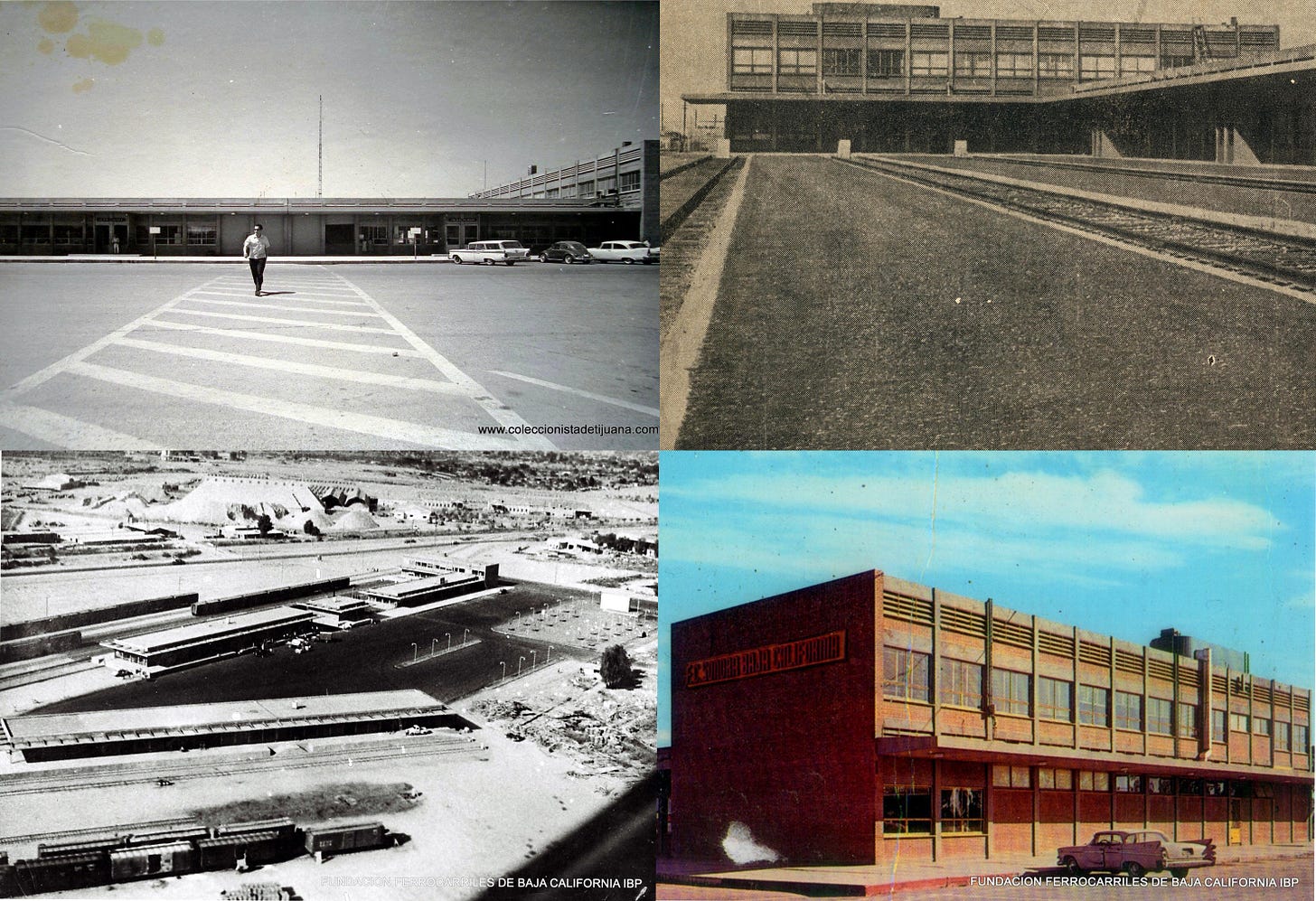
Whether it was intentional or not some of the border stations have a style that is a deviation from most of the Mexican stations of that era. They are slightly more industrial in their aesthetic, perhaps owing to the fact that many of the stations served double duties as cross border freight yards. The stations at Mexicali and Nuevo Laredo could have been built in the American midwest or Southwestern Ontario and not looked completely out of place at the time (platform canopies aside).
Mexicali Station was both a passenger rail terminal and busy freight yard. The aerial photo in the bottom left gives a sense of how large the overall complex was. Image from Fundacion Ferrocarriles De Baja California
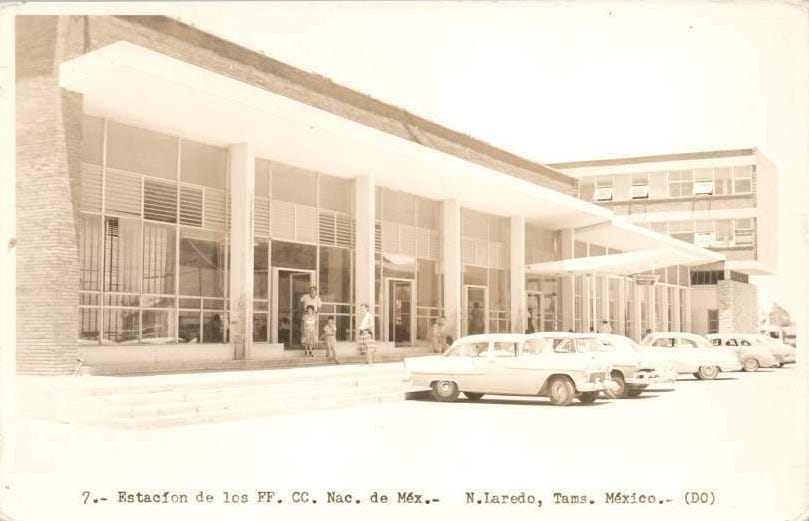
An undated image of the main entrance to Nuevo Laredo station. This was a flagship terminal station for N de M with one of its most upscale services to Mexico City departing from there.
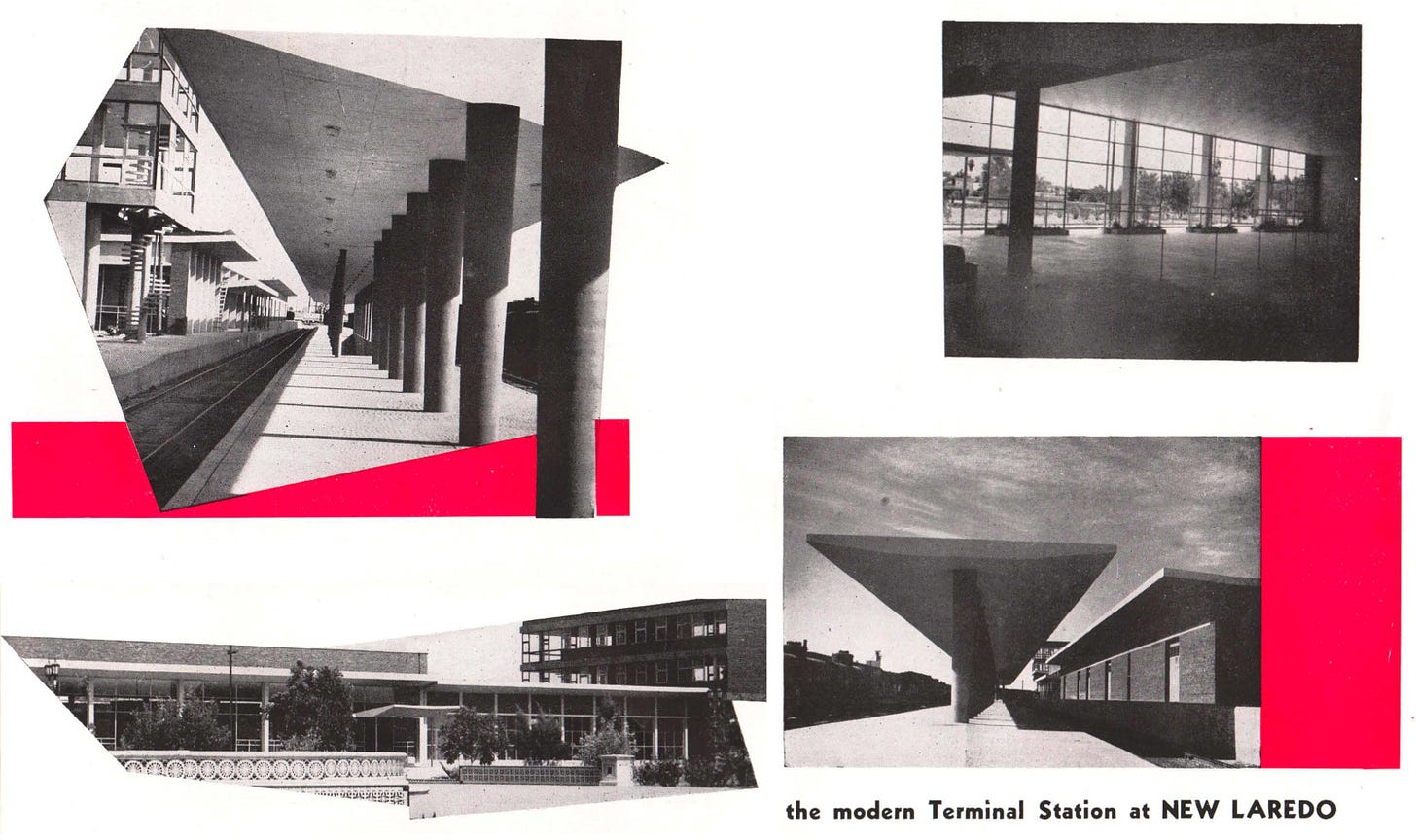
The collage of images for the Nuevo Laredo station offer a look at the large waiting hall, the concrete canopies that are a constant across all Mexican railway stations at the time, and the overall modernist aesthetic. This would have been a lovely place to wait for a train, if you could afford it. Images from N de M brochure from Streamliner Memories.
For the stations in the country’s interior there was more of a European sensibility to their aesthetic than those along the border. They were the epitome of functional, international style glass boxes. There were big interior spaces for easy passenger flow. Exteriors were predominately glass with either stone or brick used for places where glazing was not suitable. Most seem to have had plenty of natural light pouring into the public spaces.
Exterior of a Union Station of sorts in Guadalajara used by both FCP and N de M taken on 30 December 1975. Image from View Of The Blue.
Taken on the same day as the photo above this shot shows the platforms at Guadalajara with another iteration of a concrete canopy. View Of The Blue.
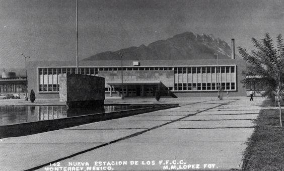
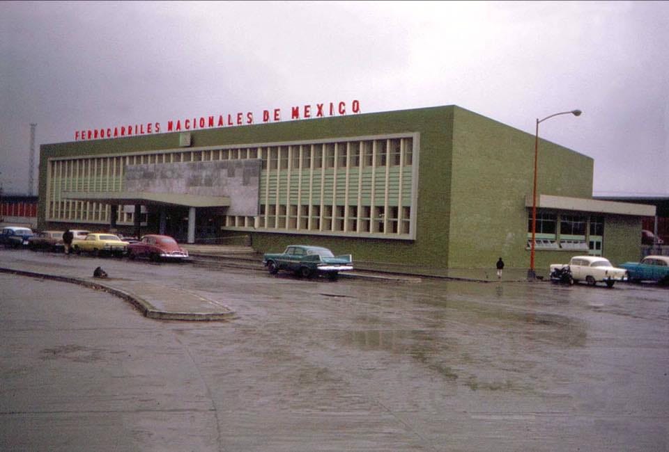
What isn’t always apparent are the colours often used in the stations. In the case of Monterrey station black and white photos completely hide the use of green in it’s facade. This is a good example of the international style integrating more traditional, Mexican elements to give it its own unique feel.
An undated photo of Monterrey station, without the requisite Ferrocarriles Nacionales De Mexico logo across the top of the building. Image via Pinterest.
In colour the vibrant, modern, and uniquely Mexican aesthetic of Monterrey station becomes clear. This shot on a sunny day with some Kodachrome film would have revealed its brilliance in full force. Image via Nostalgia Monterrey.
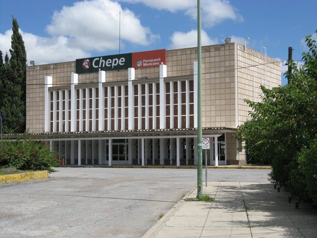
One of the smaller rail stations of that era was built in Chihuahua. It is a functional, modernist box, like its larger counterparts, though somewhat less refined. When it was built, and by whom it was designed by, is unknown (as is the case with many of the stations). However, it is one of the few railway stations from the era that is still performing its original duty as it is served by Chepe, who operate the line as a scenic tourist train (with one trip a day also serving more local and flagship destinations).
Chihuahua station, which currently serves as a station for Chepe service, was either once on the Chihuahua Pacific Railway, or on the Ferrocarriles De Baja California, depending on the source. Image by Juan José Cabuto Vidrio from Mexlist.
One of the other stations that still remains in use is Buenavista in Mexico City. Unsurprisingly, this is among the largest stations built, though not pinnacle of modernist railway station design (that is yet to come). It is also one of the few stations in which there are actually a few more details known about it. It originally opened in 1959, and was the third station to occupy the central area in Mexico City (the previous station was torn down to make way for this new facility). And there is an architect for this project, Jorge L. Medellín, whose most famous work was the Maison du Mexique in Paris.
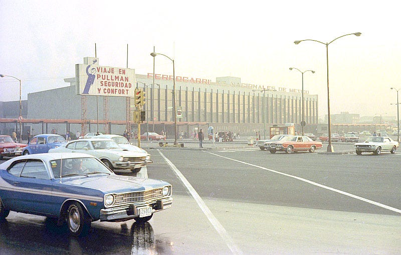
Outside Buenavista Terminal on 6 January 1976, with a billboard advertisement for Pullman sleeper cars. View Of The Blue.
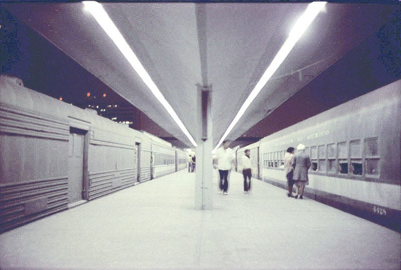
A very moody, night time view of the platforms at Buenavista station on 4 January 1976. View Of The Blue.
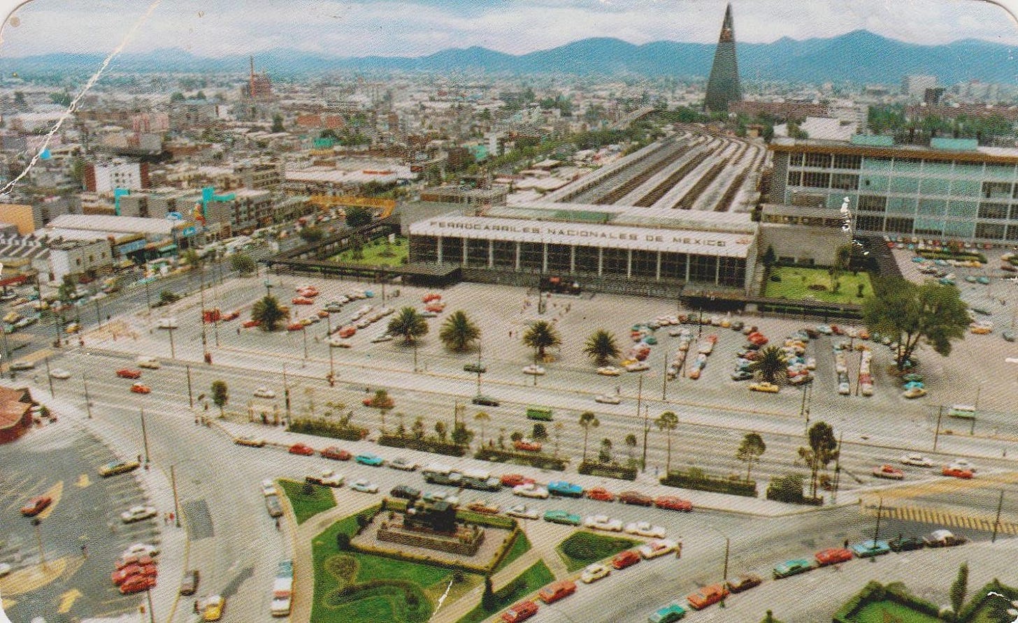
There was clearly an attempt to make the station a vista point as you travel north on Jesus Garcia. And like most of the stations from that time the front plaza was mostly just a parking lot. One consistent theme of all the stations from the modern era, whether along the border or located in the interior, is the focus on integrating parking and arrivals by car, instead of a frontage that interacts directly with the street. This was perhaps the most North American element of their designs as the same trend was taking place in anything built further north. In subsequent years the parking lot in front of Buenavista would disappear, though the resulting pedestrian plaza is still not integrated with the street front as a metal fence creates a clear delineation between the two.
Postcard from the early 1960’s showing an aerial view of Buenavista station and the top of Jesus Garcia. Image via Traveler Drawer.
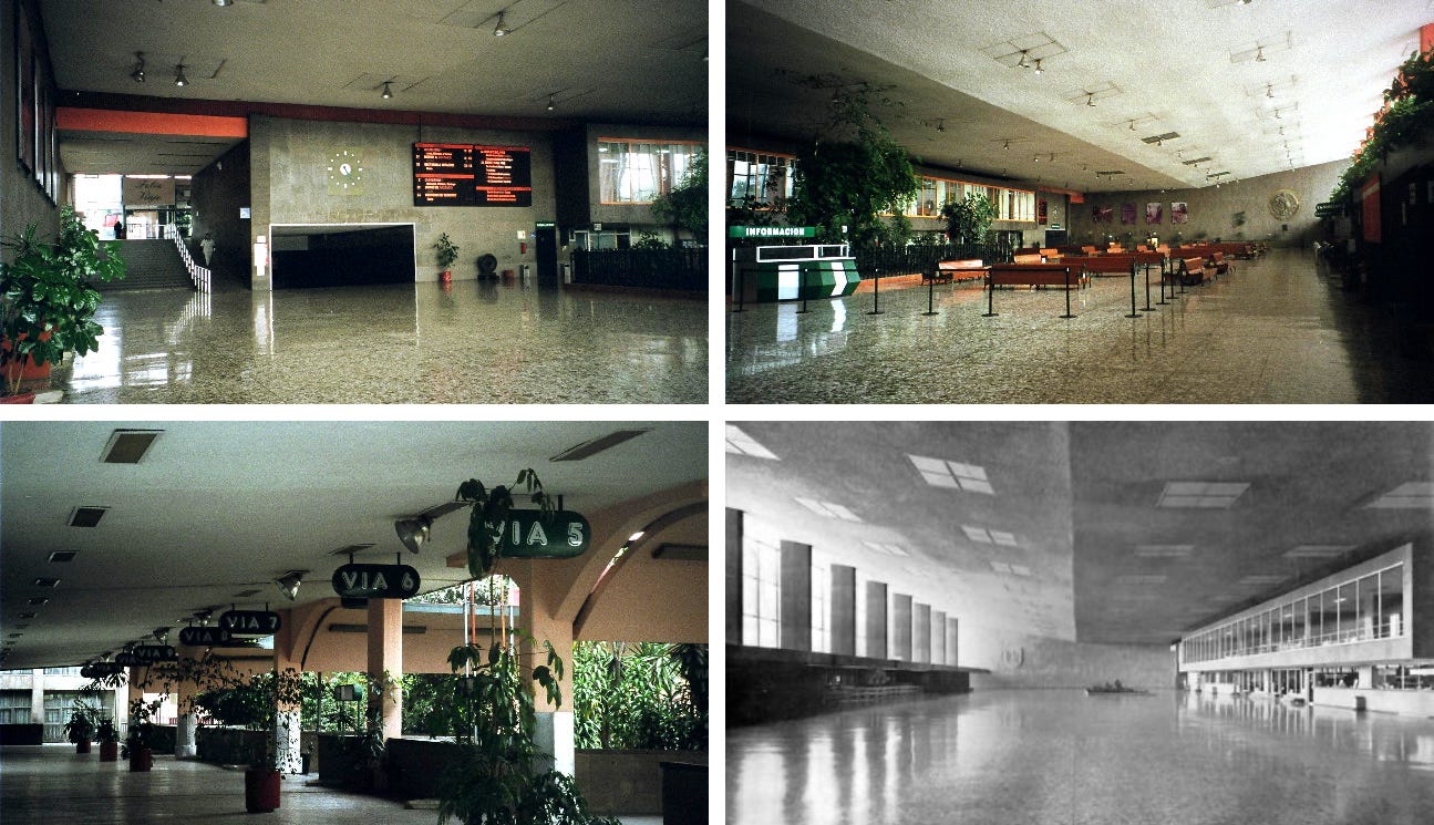
This is also one of the rare cases where there are photos of the original interior. It was as large as it looked from the outside, with tall ceilings, lots of natural light, and stone and marble for the walls and floors. Orange accents offered a touch of colour as did the greenery, both in the main hall and on the platforms.
The interior of Buenavista station, as it was when it originally opened. Particularly joyful is the font used for the platform signs. Top left, top right, and bottom left images by Marco Polo Pérez Loredo from Mexlist. Bottom right image from Una Vida Moderna via Pinterest.
There were no descriptions of what people using the station actually thought about it. Perhaps it was a poor passenger experience even if it was exceedingly pretty at the time, something that ultimately does matter a lot.
Nogales
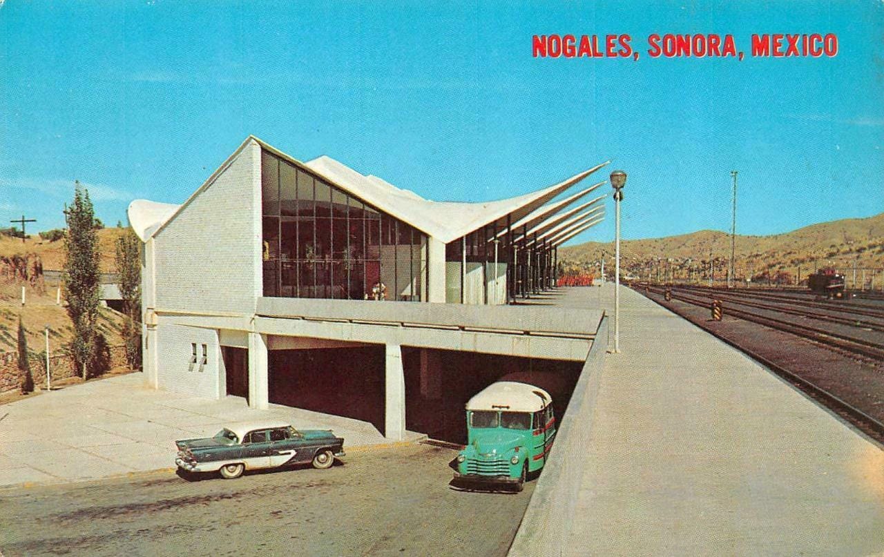
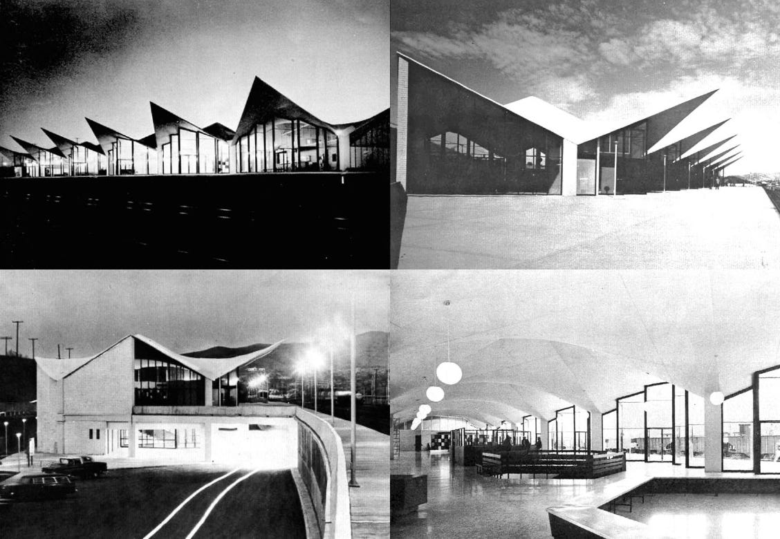
Buenavista, despite presumably being the busiest and most important station in Mexico, was not the best of the modernist era. That title would go to the station in Nogales, a town on the Arizona border, where a city of the same name sits on the other side. It was built in 1962 and designed by architects Pascual Broid, Benjamin Méndez Savage, Carlos Ortega Viramontes and Oscar Urrutia.
The design speaks for itself. It was modern, striking, and bold. It used concrete to evoke the same kind of drama that Ero Sennin did with his TWA Terminal building at JFK airport, albeit on a smaller scale. It was the technological optimism of the jet age in the form of a railway station, which is something that rarely happened in North America. Architecture and design is subjective, and reactionary trads will absolutely hate everything about it. But it is likely that many people would agree that it is not just one of the most beautiful North American train station of that era, but one of the best throughout the entire 20th Century.
A postcard showing off Nogales station among the desert landscape and clear blue skies.
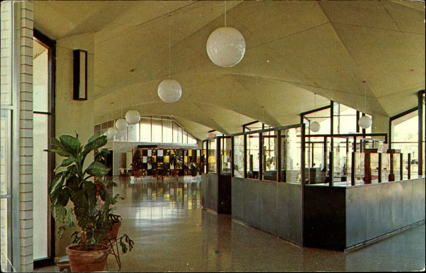
The interior was bright, simple, with subtle touches that make it feel like a Mexican station.
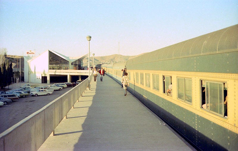
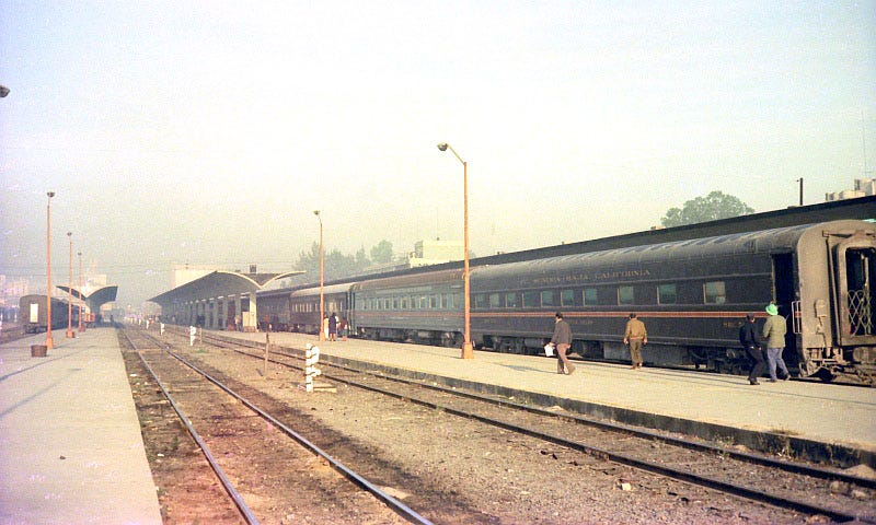
The contrast between the modernist station and the train with equipment that was likely from the 1930’s or 40’s sums up Mexican railways at the time. On one hand there was optimism, but there was also the reality of day to day operations and simply trying to keep the railways afloat. Replace the aging train with a more streamlined, 1970’s variant, and this would have looked like an idealists view of the future of rail travel. Image from View Of The Blue.
The rest of Nogales station, including the platform canopies, can be seen. Being a terminal station this would have had multiple trains parked at any given time. Image taken on 7 January 1976 View Of The Blue.
A collection of black and white images showing off Nogales station at night, and during the day. Images from Una Vida Moderna.
The station itself has not been used in decades at this point. Remarkably, it has not been demolished, though it is abandoned, the windows are gone, and now has a very busy highway next to it. Whether the station ever sees another passenger train again is not known, though it seems unlikely.
There are other design aspects of the late 1950’s to perhaps the early 1970’s era that are even more difficult to uncover, and that has to do with the graphic design and branding of posters, information booklets, signage, and other ephemeral. Like the trains themselves, it is possible that not much was done in that regard. But the few examples below show there may well be a hidden cache of modern graphic design waiting to be found.
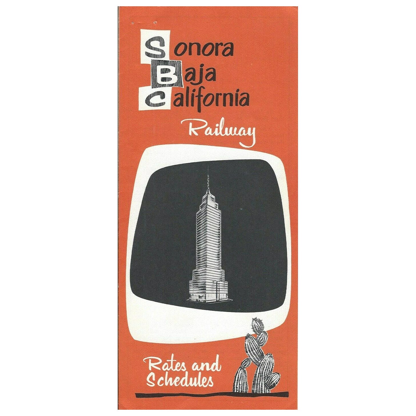
Cover of a timetable for the Sonora Baja California Railway from around the early- to mid-60s.
Inside pages of a brochure for the Aguila Azteca train. Image from Streamliner Memories.
Urban public transport and the end of the passenger rail era
The decline of passenger rail in Mexico was a slow process. Unlike in the Canada and the US, where passenger rail was privatized up until the 1970’s when Amtrak and VIA were created to try to salvage the remnants of the industry, nationalization of all the railroad services in Mexico started in 1929 and was completed by 1937. There were some exceptions, but passenger rail had already been nationalized for 40 years by the time VIA was created. Just as nationalization was the only thing that kept passenger rail in Canada and the US from a total collapse, the same was true in Mexico. Once the railways were privatized the passenger rail business was swiftly shuttered.
The signing and enactment of NAFTA was always going to be game over, but it wasn’t the only factor at play. More affordable air travel, the rise of cars, and the poor condition of many parts of the Mexican railway network all played a part in the decline. But, as has been seen in other regions of North America, urban public transport would actually continue to grow and expand as intercity rail declined and collapsed.
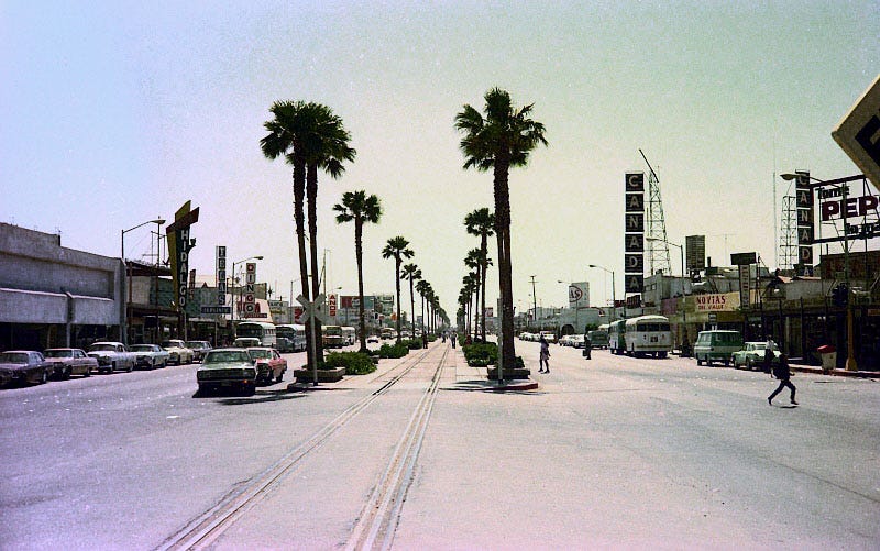
Though this photo of the main thoroughfare in Mexicali, taken in April 1975, may look charming and twee, it was indicative of the problems railways were facing. Rail lines running down the centre of main streets, through the heart of cities commercial centres, be they big or small, meant the slow, inefficient movement of trains along them. Fixing these issues through bypasses and new lines would have been a costly endeavour and was not in the budget of N de M at the time. Image from View Of The Blue.
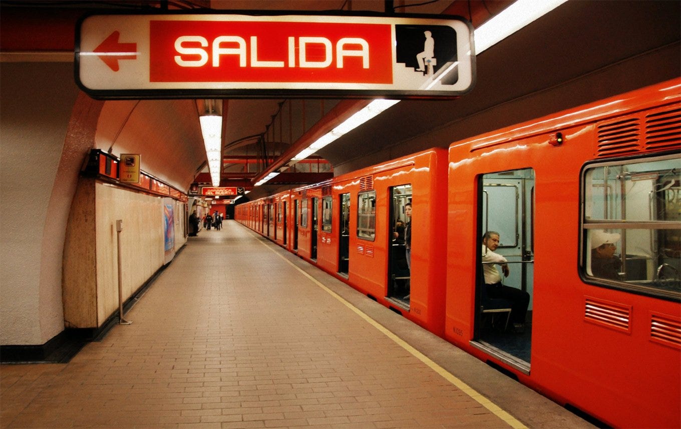
In September of 1969 the first section of the now massive Mexico City metro system opened. It looked much like Montreal’s metro system from that era, even down to the use of rubber tyre vehicles on the line, instead of the conventional steel wheels. Not only was it desperately needed, but it was quite good (something that cannot be said about some of the more recent efforts).
If this picture had a blue train instead of an orange one, and signage in French, it could easily pass for a Montreal Metro station. Image LW Yang by via Places Journal.
The signage developed for the metro incorporated a very unique element. Because literacy rates at the time were not particularly high, each station was represented by its own distinct symbol. Created by Lance Wyman, an American graphic design artist, this allowed the system to be accessible to all people. While literacy rates are now at a level that these symbols are not needed, the tradition has continued to this day.
On the left is an exterior sign for one of the Metro stations. The middle symbol is the unique image for that station. The right image is from a display at the Metro Museum and shows the various station symbols. The background colour is the Metro lines designated colour, with stations serving multiple lines having multiple background colours. Left image from Andy Butler on Twitter. Right image from exhibit at Metro Museum via KJZZ.
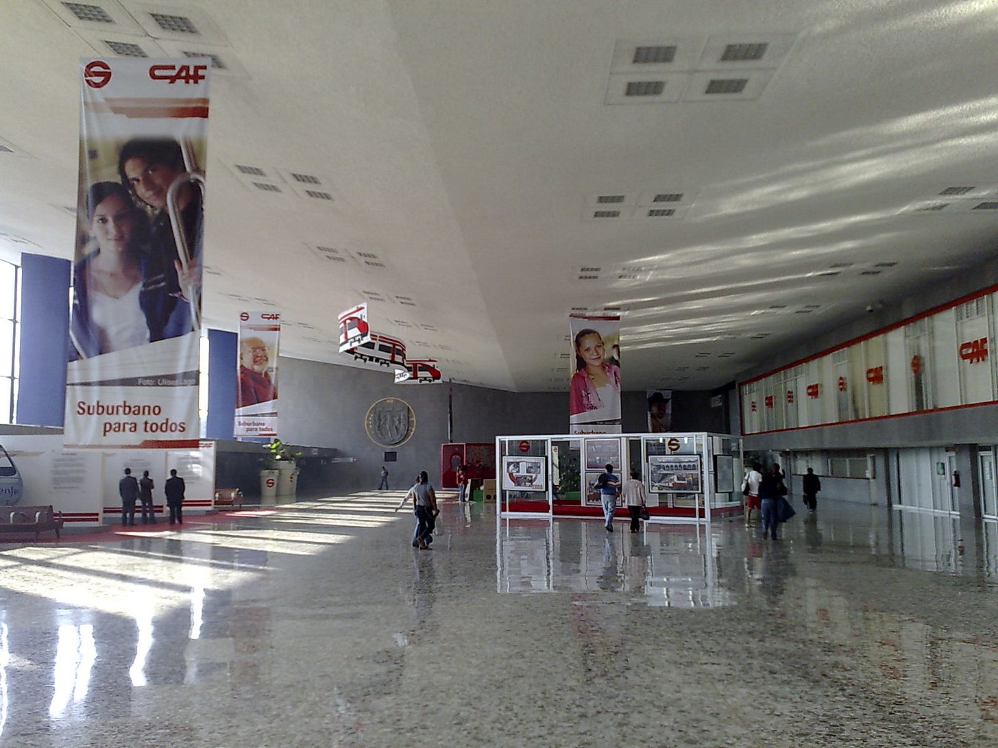
Buenavista station would remain empty for a decade until the launch of the Tren Suburbano in 2008, a new suburban train service. Though it was more like a long distance metro, this gave the station a new lease on life. Currently, it is only just the single, original line that serves the station. This could change in the future with expansion being planned, and the under-utilized station more than able to handle additional traffic.
Taken in 2008 around the time the Tren Suburbano opened, the interior of Buenavista station certainly looks less grand than it did when first opened. But the large interior spaces mean that it is easily adaptable and can handle the growing needs of the city. Aesthetics aside, it is still able to serve its original purpose, even in the context of the 2020’s. Image by Gwolf from Wikipedia.
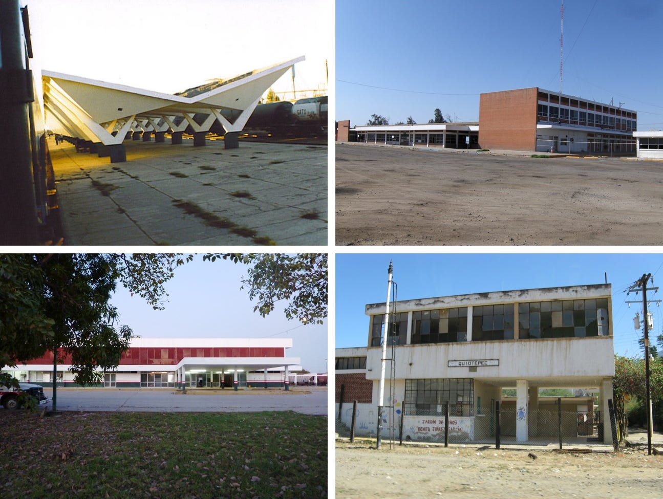
By and large though, most of the former stations are simply abandoned and often in a state of disrepair. A few have been adapted for other uses, and in some cases still serve a key function for freight railways that continue to use the lines. Like Nogales station, maybe these will one day be used for passengers again, but it is far more likely most will take on a new role, or one day be demolished.
The former station in the border town of Ciudad Juárez. by Ned Carlson.
Various images of stations as they exist today. The top left image hints at what else there is to be uncovered as it is the only image of not just the canopy at Sufragio station, but of that station at all. The bottom left image shows the front of the station in Mazatlán which is actually in remarkably good shape, while the other two photos show buildings in various states of abandonment. Top left image at former station in Sufragio, Sinaloa by Alejandro Gómez Nísino. Top right image at former station in Mexicali on the Baja California line by Roberto Ruelas Gómez. Bottom left image at former station in Mazatlán, Sinaloa by Roberto Ruelas-Gómez. Bottom right image at former station in Quiotepec, Oaxaca on Baja California line by Juan José Cabuto Vidrio.
As has happened elsewhere, decades of investment in urban transport, often pushing further and further from the city centre has developed a renewed interest in longer distance intercity passenger rail travel. This new era in Mexico is just starting and what has emerged from it so far might surprise people. In some regards it is just a reboot of its past traditions, with contemporary architecture and construction techniques. But it is also much more complicated and controversial.
“The” ultimate tourist train
North America has already proven itself to be really bad at building new intercity rail service. There is the disaster known as California High Speed rail, the not-so-privately funded Brightline and it’s highly exclusive and exclusionary service. Canada has joined the fun with the increasingly complicated mess and corporate freebie known as VIA HFR. And Mexico has the Tren Maya which stands proud and tall amongst this group.
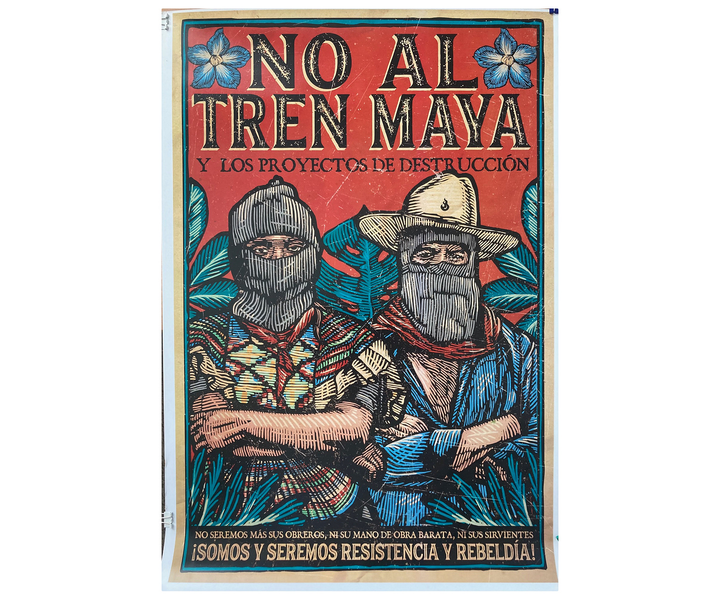
The ins and outs of the Tren Maya are far too complex for this article to fully breakdown. But in short, this is going to be a 1500km rail network (both passenger trains and freight will be using it), that is primarily about serving tourist destinations. There is a lot of resistance from the Mayans who live where most of the network will be located. They claim that the line fails to serve local communities, and may harm them and the environment in the name of catering to the tourism market. In some cases rail lines still run through the centre of towns, as they did in Mexicali in the mid-70’s, and will remain as such, except with a dozen or more passenger trains running down the streets as quickly as possible.
Zapatista designed anti-Tren Maya poster. This is modern day Mayan design at its finest. Image from Schools For Chiapis.
It would take some impressive mental gymnastics to deny the negative impacts this project will have on many communities. And the project doesn’t really hide their contempt for those places. It is even evident in the design of the stations and the train interiors themselves that the only purpose is serving tourists and Tik Tok sales people, also known as “influencers”.
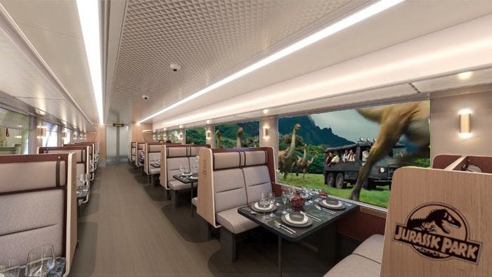
One of the renderings released by Alstom, who will be manufacturing the trains for the line, has a style and aesthetic that looks like it could be serving Jurassic Park. Everything about it screams upscale Disney World experience instead of something resembling affordable, accessible public transport.
The Tren Maya would be the worlds most popular train if its Jurassic Park inspired design was matched with an actual trip through Jurassic Park. Original image by Alston from the Mexacnist.
A lot of negative aspects are dismissed or glossed over in part because of its flashy marketing and the wow factor of the project. Many of the stations themselves really are quite striking, at least as they appear in the renderings. From a design stand point they often do a lot of things right. Stations that are located in forested areas of the peninsula, like the one in Valladolid, employ an extensive use of wood to better blend in with the surrounding landscape. The use of glass is also minimized to avoid turning them into greenhouses, though first class customers are likely to have their own air conditioned lounge away from the elements.
Multiple renderings of the rather lovely and zen Valladolid station. The extensive use of wood is perfect for its forest surroundings. Image from Proyecto Tren Maya.
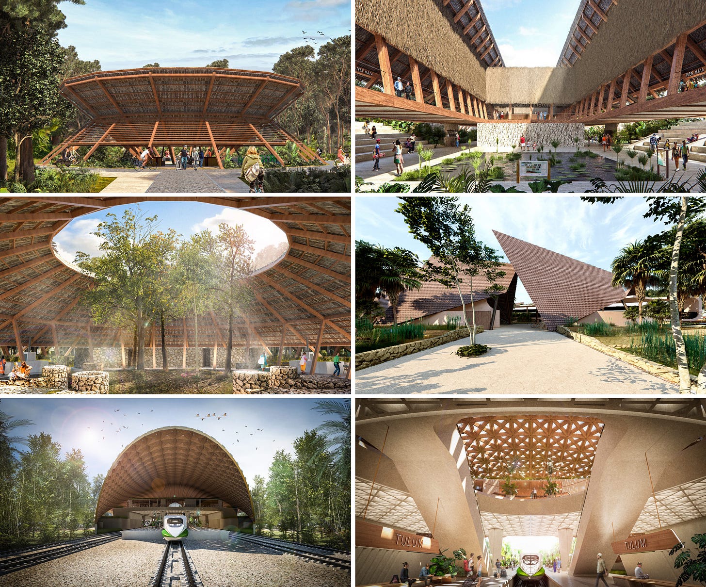
There are also several stations, largely located around key tourist sites like Tulum, that draw their inspiration from Mayan architecture and traditional designs. Some of the stations are undeniably stunning. In particular the station at Nuevo Xcan could be the most brilliant station built in North America since the station in Nogales was constructed. There is a lot to like about it though the actual execution of the project will ultimately determine if it comes out refined and dignified, or looks like the entrance to a theme park ride.
But all that lovely talk around inspiration has not really translated into collaboration. The station in Chichén Itzá has been designed by the Mexico City based urban design and architecture firm AE GAYARANDA, which is run by Ana Elena. In Palenque the station there was designed by DAFDdf, also out of Mexico City. In some regards it is great to see women lead firms take on two of the higher profile projects, however neither indicate a collaboration with local Mayans as part of the design process. The station in Tulum was designed by Mexican and English firm Aidia Studio which talks extensively of being inspired by traditional Mayan design, but again does not seem to have involved them in the project. One of the few exceptions seems to be Nuevo Xcan station which was designed in collaboration with a delegation from local Ejido’s (which are local land cooperatives) and does appear to have to engaged in meaningful consultation.
A collection of “Mayan inspired” stations. They are undeniably beautiful. Though whether they are completely authentic to Mayan design traditions, and how much collaboration with local Mayan communities actually took place is an entirely different issue. Top left, right, and middle images of Nuevo Xcan station from Proyecto Tren Maya. Middle right image of Tixkokob station from Proyecto Tren Maya. Bottom left and right image of Tulum station from Proyecto Tren Maya.
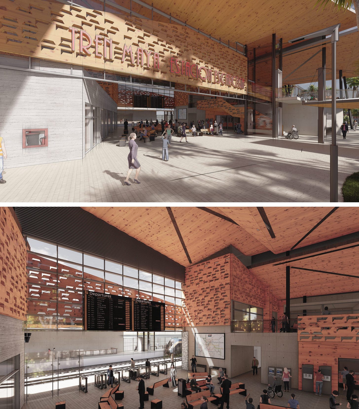
Even some of the more seemingly benign inspirations are complex. The National Fund for the Promotion of Tourism describes Escarcega station as having been inspired by the local chewing gum industry. However, when the Mexican government put down Mayan “rebels” in the 1940’s, they also took control of the land that many Mayan run chewing gum forests were on and put them in the hands of government run cooperatives. This move has been tied to the economic decline of local Mayans in the subsequent decades.
Interior of Escarcega station. A wonderful space with an odd, rather complicated inspiration. Image from Proyecto Tren Maya.
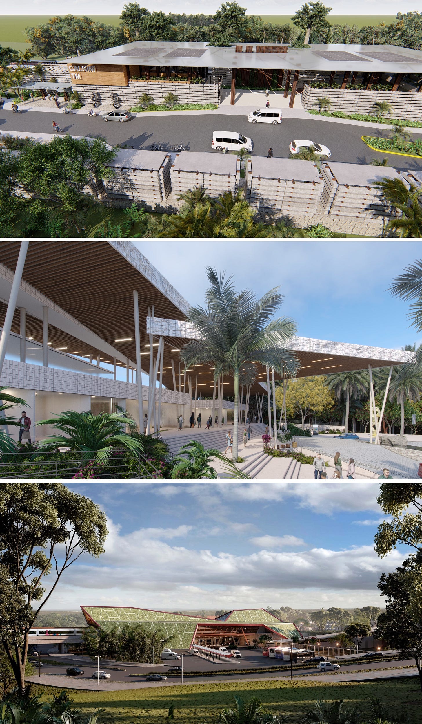
A number of stations seem to make no nod to the local culture and are much more generic in their design. The stations in Calkini, Tenabo and Hecelchakan are all largely carbon copies of the same design, with a few variations to mix them up. They adopt the same open air, but protected, program of the posher, flagship stations. In the end they will serve the same function, perhaps even better given a more simple and straightforward design will be cheaper to build and easier to maintain.
A small majority of the stations adopt a simpler design style compared to the lines flagship stations. As can be seen few of the stations are actually in the heart of cities, with the surrounding area designed for tourist buses and taxis. Top image of Estación Paradero Calkini (and Paradero Tenabo and Paradero Hecelchakan) from Proyecto Tren Maya. Middle image of Paradero Maxacunu from Proyecto Tren Maya. Bottom image of Estación Palenque from Proyecto Tren Maya.
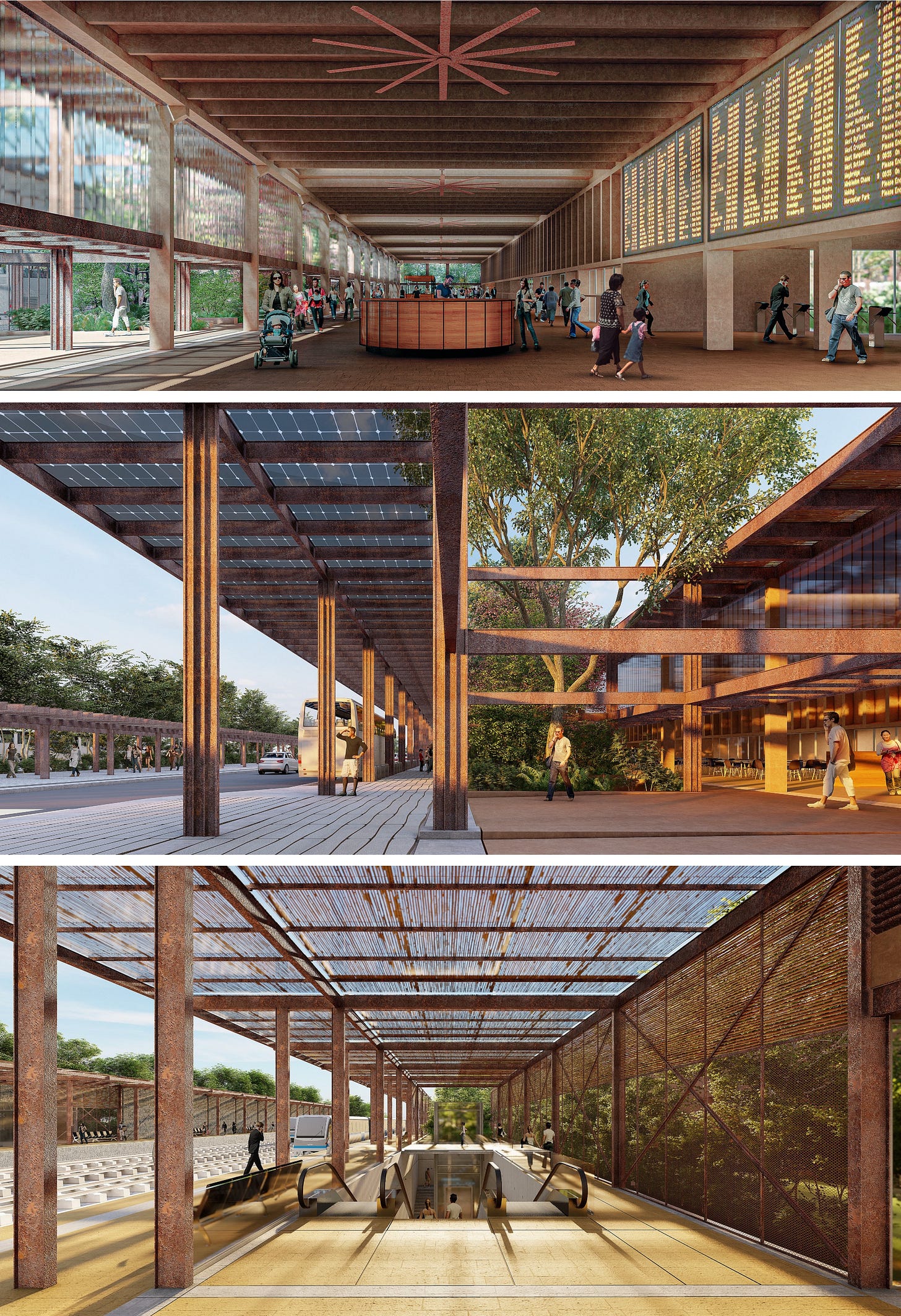
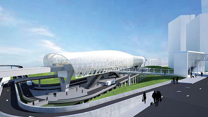
The Tren Maya is not the only passenger rail project on the radar. A 57 km commuter line from Mexico City to Toluca is under construction and unlike the Tren Suburbano will use full size trains. However with what has been released to date its stations do not seem to look as though they will set the design world on fire. They look like they could belong on any commuter rail system in North America… or parts of Asia… or Europe… or anywhere really.
A generic design for an unnamed station on the Mexico City to Toluca line. Image from Sener.
This is not necessarily a bad thing. Not every station needs to be suitable for the covers of architectural magazines. And if simple stations result in cheap stations, and help make construction more likely and affordable, then that is a reasonable trade off to make.
More hidden gems await
With a lot more historical materials to uncover, and even more new passenger rail projects likely to happen in the future, there is good reason to believe there is a lot more to come from Mexico. One can hope that in the long run most of the modernist stations can be saved and revived as it would be a shame to lose some of the best examples of what is a rare style of railway station within North America.
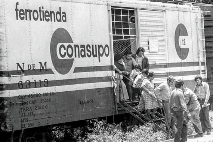
A boxcar converted into a rolling grocery store. The modern logo and font of Ferrotienda Conasupo hints at yet more Mexican railway modernism waiting to be uncovered. Image from Well There’s Your Problem.
There is likely a lot that can be learned from Mexico’s experience, from the complete collapse of passenger rail service, to a slowly emerging revival, and the complexities that underlie current day attempts to build new networks. Canada in particular can learn from the controversies of the Tren Maya as it begins to build intercity rail through indigenous lands and continues to struggle with it’s relationship with those communities. Mexico is an easy country to overlook, but it really shouldn’t be.
If you want to find me on social media you can do so @Johnnyrenton.bsky.social on Bluesky. If you have any thoughts or feedback let me know in the comments.


