Designing VIA Rail
A look at the branding, marketing and identity of VIA Rail Canada from 1976 to 2022
While it has only been around for 46 years, VIA has already had a tumultuous, complicated history, both as a company and with its relationship to Canadians. For some it conjures up visions of stainless steel trains rolling through the Rockies. Others might see it as a utility…just that thing they take when they go from Ottawa to Toronto, or to visit parents on a weekend to get free food and do their laundry. Then there are people who see trains as a dead technology, a pointless way to get around in a world where cars and air travel are tops.
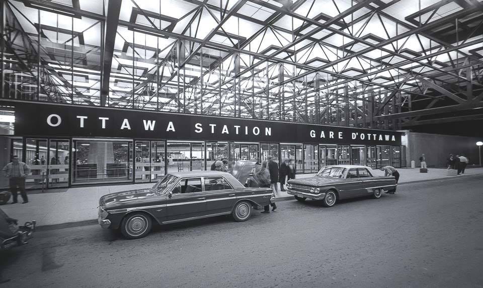
The entrance to the newly opened Ottawa station in 1967. The stations remarkable design, and its location next to a highway to cater to passengers arriving by car, would symbolize everything that was good and bad about passenger rail in the 1960’s. For many decades it would also remain under-utilized and it wouldn’t be until the 2010’s that stations true value, and potential, would start to be realized. Image via Ross Dunn on Flickr.
Whatever your view of VIA might be, a great deal of it has been shaped by the agency’s brand identity, its graphic design, and the image it has put forward in media and through any designable element a passenger might encounter. What began with some degree of hope and promise, in part by building off the strong design culture of CN, quickly faded. For decades VIA would look generically corporate, tired, and come to symbolize budget railroading. Recently, in conjunction with VIA’s modernization campaign, this has started to change as almost every part of its brand identity, except for its logo, is being reshaped from the ground up.
At first glance design might seem like a rather trivial aspect of passenger rail operations. But it goes beyond magazines, television ads, and timetable covers and includes stations, passenger car interiors, lounges, and the overall experience delivered to passengers using the service. A good brand can be made better through excellent and thoughtful design, though even great design cannot mask inherent flaws and weaknesses.
Even in the 60’s and 70’s, before VIA was even a concept, its destiny was being shaped by the efforts and direction of CN and Canadian Pacific who operated the majority of the passenger rail services in Canada. And those companies themselves were being transformed, and challenged, by broader social, cultural and technological changes that made rail travel far less desirable and was driving away public support for the kind of large scale investments that were needed to keep it relevant. Times were somewhat bleak for the rail travel. But there was also a strong design culture for VIA to build upon, which at least offered a modicum of a chance to for the agency to develop a contemporary identity, and change how people viewed rail travel.
Going down in style: CN in the 1960’s and 70’s
From he 1920’s until the start of the 60’s, Canadian railways, in particular Canadian Pacific, were at the top of their class when it came to design. One such example of this were Canadian Pacific’s travel posters which put forward a posh, romantic view of rail travel and luxury resorts that still shapes some peoples visions of rail travel today. The vivid, technicolour posters are sought after not just in Canada, but across the world, often going for several thousand dollars and commanding the kind of prices usually reserved for TWA or Pan Am materials.
These Canadian Pacific posters, and the remarkable artwork and design of them, would understandably become iconic. They were a mix between the trains, the people, and the places. They have long captured peoples attention, and even Carmen Sandiego felt compelled to take one of the trains. Posters originally produced by Canadian Pacific and images via Ornamentum, and AllPosters.
In 1960 CN was going to make a radical departure from the typical design culture of railways. It unveiled an all new logo, designed by Allan Fleming, and every single aspect of its brand identity would become undeniably modern and forward thinking, especially when it came to its passenger rail operations. There were three areas in which this new brand identity and design ethos was applied, and would ultimately impact VIA in the future.
This drawing, from perhaps 1959, was a collaboration between Allan Fleming and James Valkus. It showed off the new CN logo and the stylized image offered a much more modern interpretation of what a rail station could look like, including a blue exterior in place of the brick or limestone that had been used since the start of the railway age. Image via York University Allan Fleming fonds.
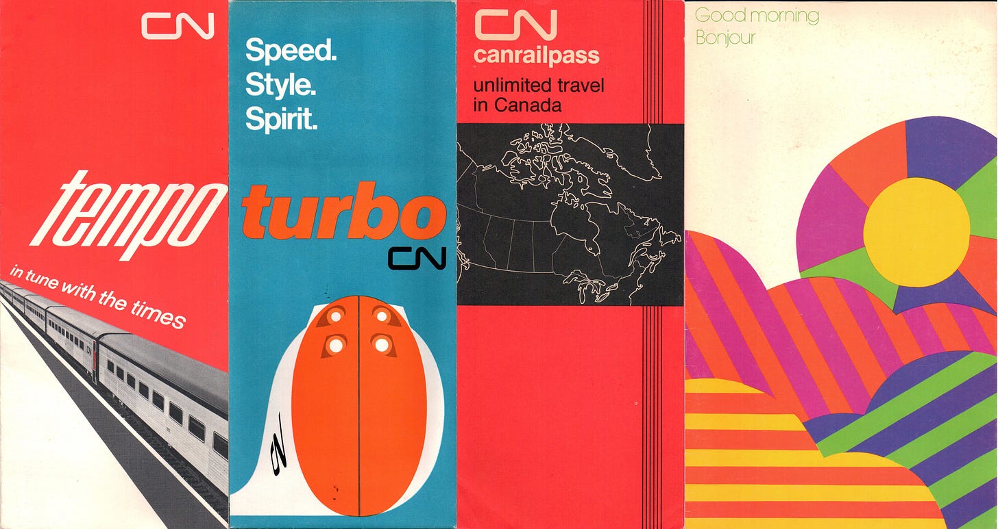
First was its promotional materials. Timetables, brochures, posters, and corporate documents adopted vibrant colours, of which CN red was the most prominent, along with a simple sans-serif font. There were still stylized drawings, but they were not the complex illustrations of the past. Often they were a single item, a single piece of equipment, set against a solid background and typically they were composed of no more than a few colours. It was all very bold and striking.
Whether it was brochures about its various passenger rail services, or the cover for a menu, CN produced work that could at times go head to head with with the graphic design giants of the 60’s and 70’s. The design aesthetic extended to internal documents, annual reports, even air mail envelopes. Images originally published by CN and scanned by the author.
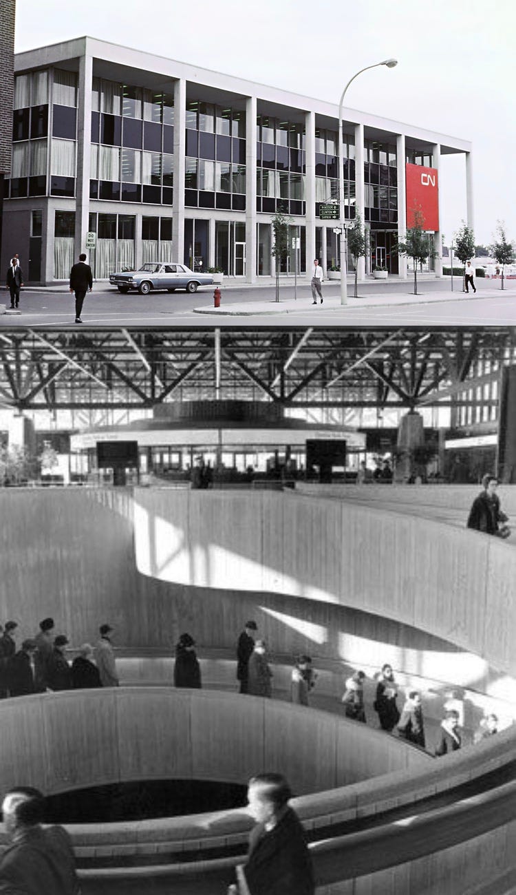
There were also new, modern stations which ditched peaked roofs in favour of horizontal lines. There were not a lot of stations built in the 60’s and 70’s. And some of the ones that were constructed were very much done on a budget, somewhere in between a portable construction trailer and a backyard shed. Yet some, such as those in London, Ontario and Kingston, in the growing Quebec-Windsor corridor, or Saskatoon station, were built to last and unabashedly embraced modernist architecture.
The pinnacle of this era is without a doubt Ottawa Station. This was not a CN project. It was done by the National Capital Commission and hosted both CN and Canadian Pacific services. It was a new Union Station for Ottawa, though now it was located next to a highway with easy access for people arriving by car. Despite its terrible location, it was easily the grandest, most ambitious, and most beautiful train station built in that era. Even within North America only some of the modernist stations in Mexico are on the same playing field. VIA would ultimately inherit these stations as part of its network, though many were treated with contempt as opposed to being celebrated and utilized to enhance its identity.
At the top is the CN station in London, Ontario, built in 1963. It incorporated some of its office needs in the top 2 storeys and had a strong urban presence, even with a car drop off area out front. At the bottom is an interior view of the Ottawa Station and its famous spiral staircase. In some regards it had more resemblance to an airport terminal of the time than what train stations had been up to that point. While Ottawa Station is in a terrible location, it offers one of the best passenger experiences of any station in Canada. Top image via Wikipedia and bottom image from Architectural Record via Midwest Modern.
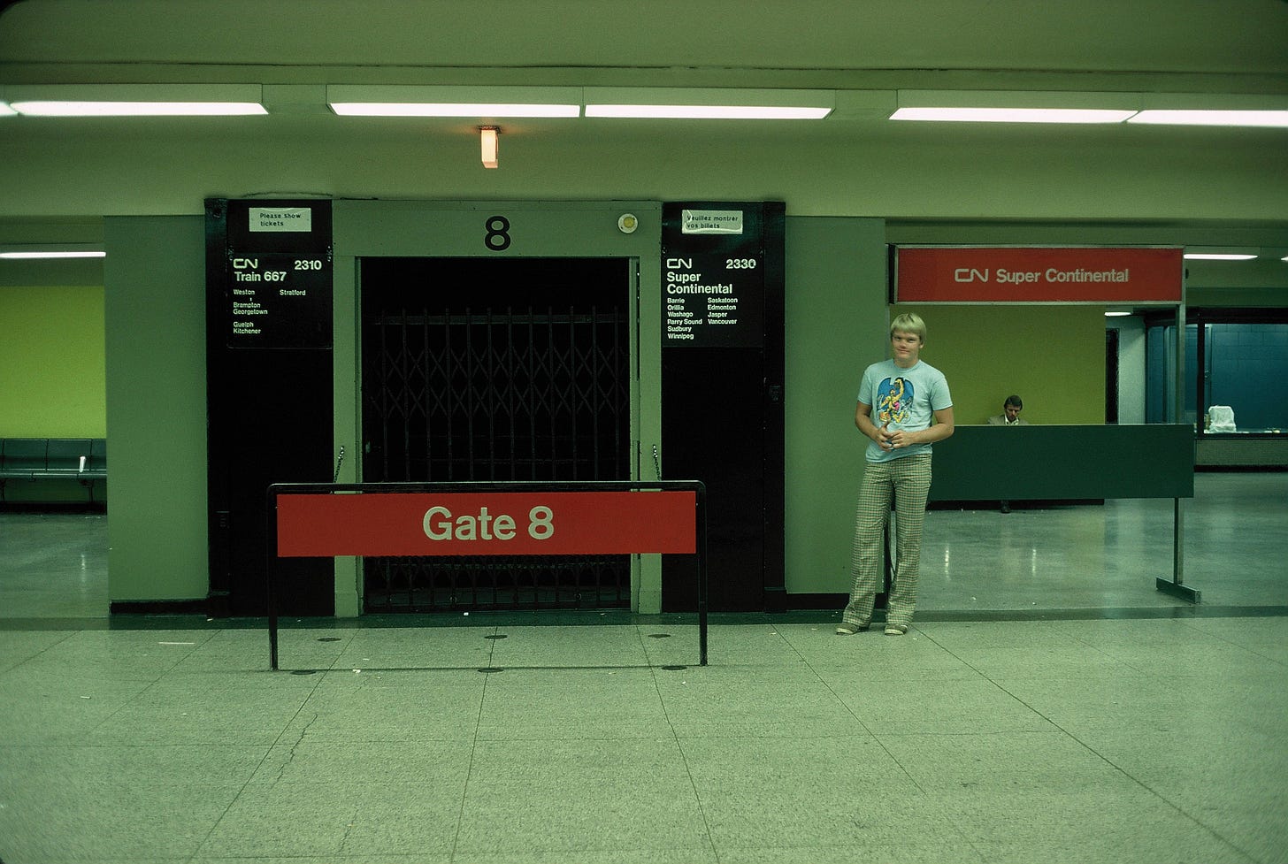
However most of the stations on the CN network at the time were at least 50 years old, built in a very different time, so they had to find a way to convey their new identity within a setting that was counter to that. The careful use of signage, furniture, and the colours for walls, helped in that regard.
A rarely seen view of CN’s passenger signage and departures area within Union Station in Toronto. Image from slides purchased and scanned by the author.
And then there were the trains. The obvious symbol of CN’s forward thinking ambitions was the Turbo Train. Designed by United Aircraft Corporation, and assembled by the Montreal Locomotive Works, it was a jet turbine powered train that was part of an experimental era where newer and faster train designs were being explored all across the globe. It was a failure, and never lived up to expectations, but its styling, inside and out, was quite remarkable. But most of Canada wouldn’t even see, let alone ride Turbo. The majority of CN’s fleet were simple diesel trains and carriages which were wrapped in the iconic red, black and white livery. Up until this past fall, after 61 years, it remained the best livery to ever grace a Canadian passenger train.
The top image shows a standard CN passenger train, in this case rolling through the rockies. And below is the infamous Turbo Train, parked at Ottawa Station. Along with the stations wayfinding signage, all of the eras modern ambitions can be seen in this one photo. Top image from 1967 CN poster scanned by the author, and bottom image via Trackside Treasures
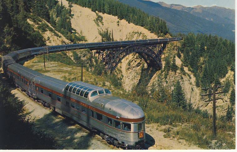
Canadian Pacific would play much less of a role in VIA’s identity and image. Throughout the 60’s and 70’s they were even more aggressive in trying to unload routes than CN was. They also put little to no effort, or money, towards modernizing their passenger services during this time. There was no Turbo Train equivalent, and there was almost no construction of new stations after 1960. Instead Canadian Pacific had opted to focus on elevating the status of its long distance route The Canadian, which at the time went from Montreal to Vancouver, by purchasing stainless steel passenger cars, complete with domed observation areas. They were the height of “romantic rail travel” in Canada, even though by the 1970’s Canadian Pacific was petitioning the federal government to discontinue the service as it was not financially viable.
A photo of The Canadian, in the early part of its life when it was still operated by Canadian Pacific. The stainless steel cars, the domes, the mountain pass… This was the very definition of rail travel as leisure and luxury, with rail travel as a service for people simply looking to get to a destination taking a back seat. Image via Trainweb.
By and large this is what VIA would inherit, with the exception of the CN graphic design department which it would have to part ways with by the start of 1977. By that point though much of what they picked up was aging, especially the trains, and was less than ideal for trying to reignite peoples interest in rail travel. It is was a shit state of affairs, and the starting point for VIA.
A company born out of desperation
Throughout the 1960’s and 70’s railroad companies all across North America, not just in Canada, wanted out of passenger rail. Ridership was declining as travel patterns were changing. In order to ensure they didn’t collapse and disappear completely the Liberal’s campaign of 1974 included a promise to nationalize passenger rail services as their own crown corporation, akin to what the US had done with the creation of Amtrak. They won, and in 1976 VIA first came into existence as a sort of subsidiary of CN.
There wasn’t much in the early days, but from day one it managed to have a remarkable logo, which is one of the few elements of VIA that has remained constant over its lifetime. Designed by Gerhard Ade, who worked for the Montreal based firm ARC, it was a play on a set of switches, the connection between two railroad tracks. The name worked in both French and English and like CN, it was a wordmark logo, with the name itself being used instead of some other symbol or pictogram.
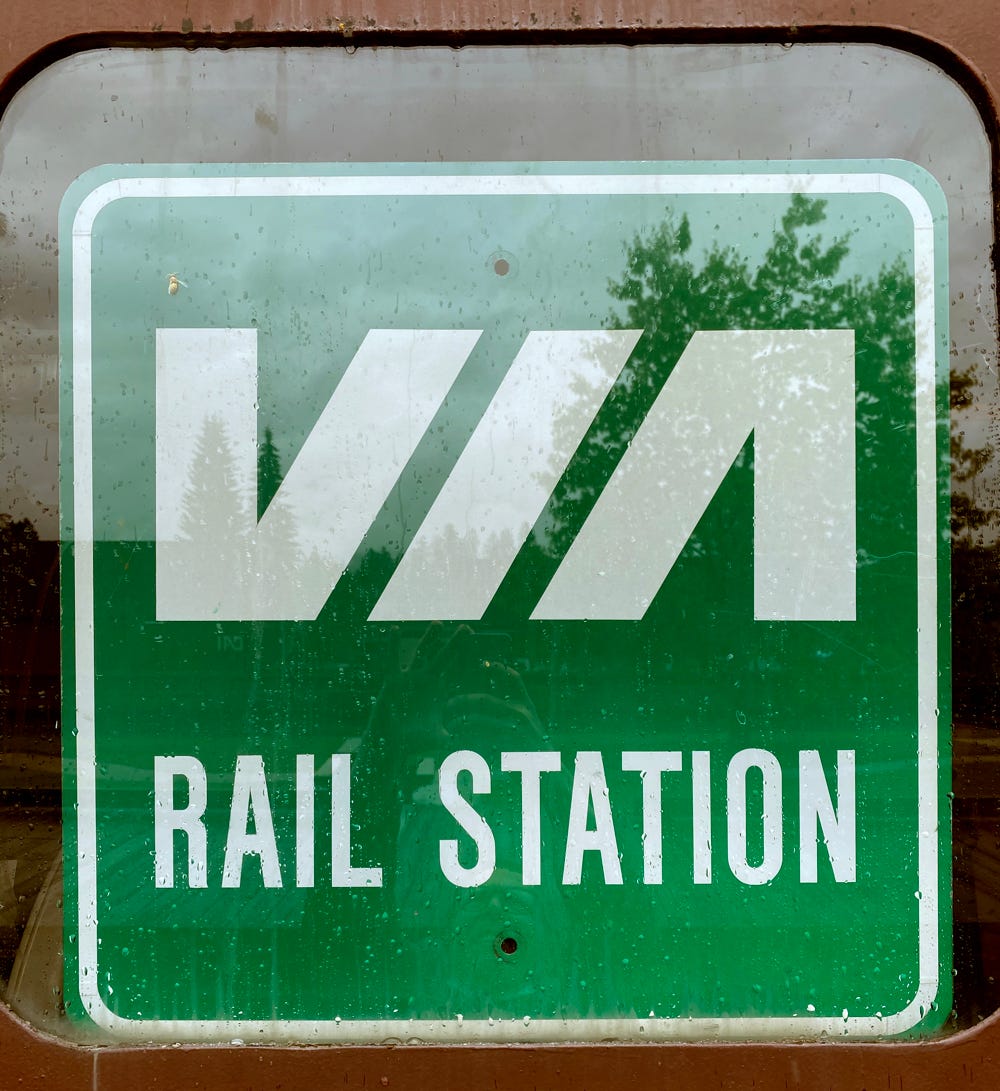
When signs were first being produced to guide drivers from the highway to a VIA train station, there wasn’t even the blue and yellow colour palette, nor was there a standardized font. The logo was all that they had when it came to the VIA identity. Image taken by the author.
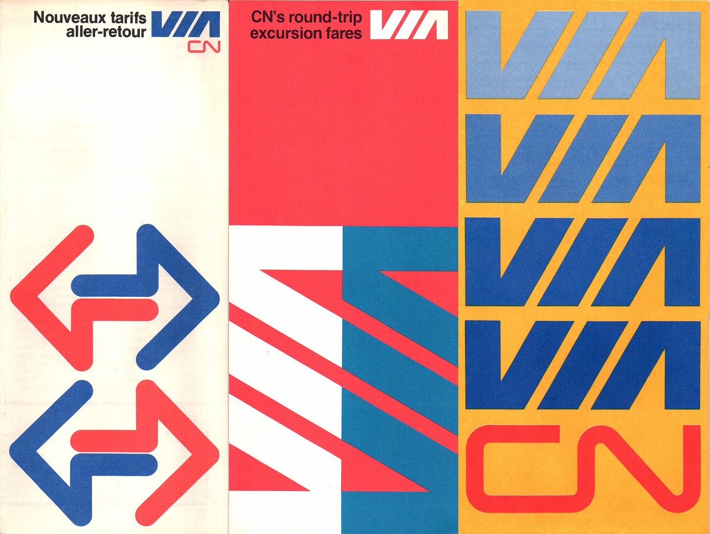
Initially there wasn’t a lot of change when it came to the VIA identity. Promotional materials were still produced by CN, and simply added the VIA logo somewhere on the page. Even as trains were starting to be painted in the new blue and yellow VIA paint scheme, many of the locomotives still included a red CN logo on the front.
In the early days of VIA it simply added its logo to CN produced materials. And it looked great. Images originally published by VIA/CN and scanned by the author.
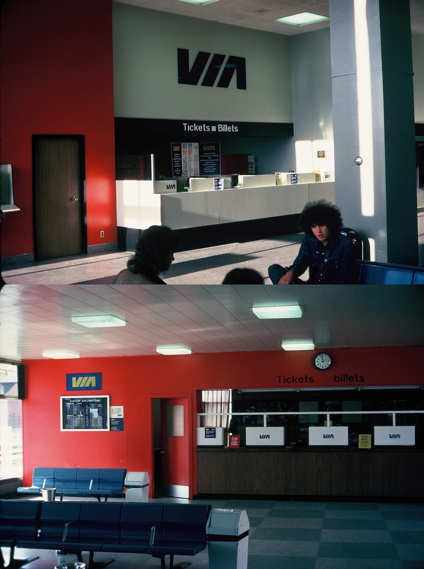
The station interiors adopted a similar strategy, in some cases up until at least the late 70’s. Some VIA logos were put up, but almost everything else, from the CN red paint on the walls, and the CN wayfinding signage, remained. The combination of CN red with VIA blue and accents of black and white looked surprisingly good. Aside from the use of a trademarked colour, the red, white and blue colour scheme probably felt a bit too American for it to have ever been considered for VIA’s identity.
The top image shows the interior of the London, Ontario station , while the bottom image shows the interior of the Windsor, Ontario station, both of which were taken in 1978, and former CN stations. Behind the counter at London station a CN brochure rack can still be seen. Images purchased and scanned by the author.
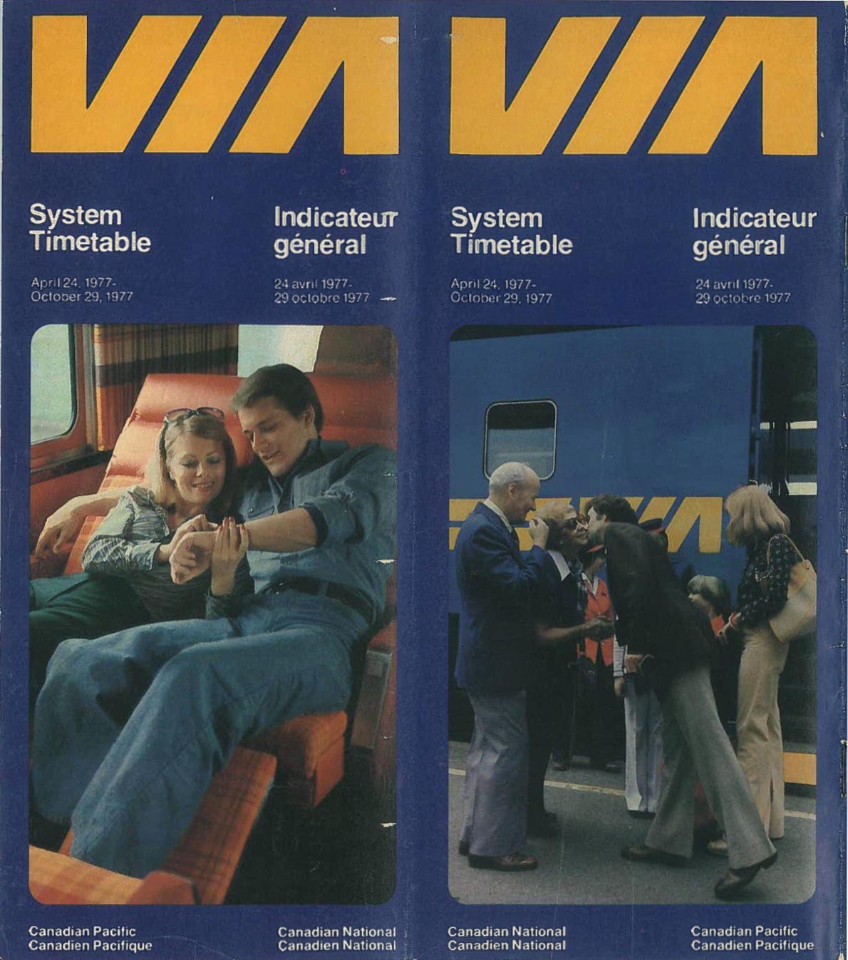
On 12 January 1977, VIA would officially become its own crown corporation and assumed full control of passenger rail services from CN (it would do the same with Canadian Pacific’s passenger services on 28 October 1978). Throughout 1977 VIA began to establish itself as a separate brand from its CN and eventually Canadian Pacific predecessors. In April 1977 it released a timetable that dropped the in house design work of CN and featured the VIA logo in yellow, against a blue background. At the time printed materials, like timetables, were the primary source of information for customers and a prominent part of a passenger rails identity, so this shift was significant.
Cover of a VIA rail timetable released in April 1977. The vision of the VIA brand was clearly starting to emerge at this point. Timetable originally published by VIA and scanned by the author.
At the same time more and more of the trains began to be fully painted in the VIA livery. This would be a slow process as even in the early 80’s it was not uncommon to see a VIA train that still had locomotives or passenger cars with a CN or Canadian Pacific paint scheme. The VIA livery was not great. All the trains needed was a spoiler made out of wooden hockey sticks to look like something that the Trailer Park Boys may have done. The trains appear to have simply been spray bombed with blue paint, and a yellow pinstripe and nose added so that there was at least ‘some’ colour.
A shot of a standard VIA train from 1985. For people who rode those trains and have fond memories of doing so, they will probably view them fondly out of nostalgia. But these giant blue blobs with a dash of yellow did not look great, and somehow made the trains seem older than when they were painted in the CN livery scheme. Photo by Johannes Smit via Flickr.
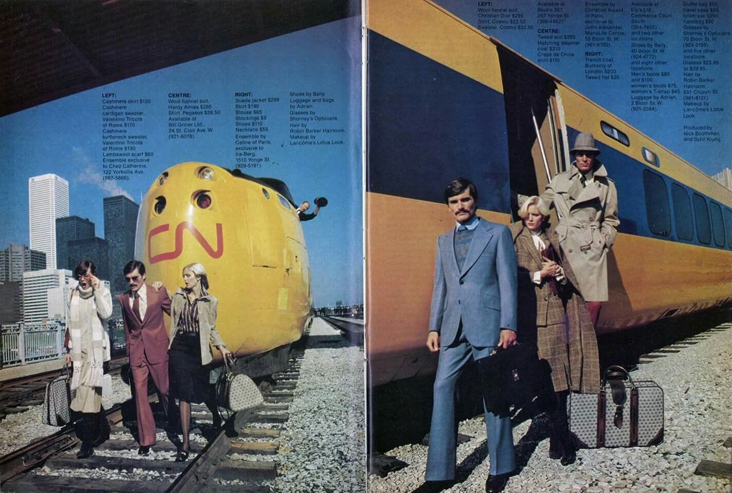
For the Turbo Trains that VIA would inherit, they flipped around the colour scheme, with trains painted in yellow and the lettering and accents in blue. It was…better…but it was a still a serious step down from the previous CN livery. While it’s branding was not as polished as that of CN’s, it was at least becoming a distinct VIA identity.
As part of a Toronto Life photoshoot in their November 1976 issue, the repainted Turbo Train is there to fill out the urban setting. The clothes the people are wearing are undeniable stylish and cool. The train is not. Image via Pinterest.
The first television commercials for VIA began airing in 1979 (or at least that is the earliest commercials that have been found to date). They play on two themes; the romantic images of the train as a place to have a dinner, drinks, maybe settle in for a nights sleep on longer trips, as you head to your destination, and the train as leisure travel, being as much a part of the vacation as the destination itself. Its a very provincial and twee ideal of rail travel, the kind of thing seniors with lots of free time in their retirement years enjoy.
VIA Rail commercial from 1979. This image of VIA and rail travel in general still persists to this day. Originally created by VIA Rail and hosted on YouTube.
Despite a shaky start there were moments where VIA briefly seemed like it might develop a modern identity, with a service to match that. For better or for worse, a relatively brief period in the early 80’s would established what the VIA brand would become for many decades.
Hello, corridor
Passenger trains in Canada had a long history of being integrated with leisure and vacations. Some of Canada’s swankiest hotels, like Banff Springs and Lake Louise, were built as resort destinations, with their railway owners directly feeding in customers with their trains. For decades, right up until the mid-70’s CN ran Maple Leaf Tours which sold packages that often included its own hotel, cruise services, and of course its trains.
With the launch of VIA Rail came VIA Getaway Tours, which carried on the tradition of packaged leisure trips. And in the 70’s and early 80’s, it was one of the two key markets they were targeting. However airline deregulation in Canada in the 80’s was going to accelerate the trend of declining airfares that had already started to change the travel market in a dramatic way. It was going to be cheaper to fly to Mexico and spend a week at a resort then take a trip out to Banff by train. Instead of taking a train from Toronto to Quebec City, you could just fly to New York City or Las Vegas.
This also happened to coincide with VIA’s first, albeit modest, attempt at some sort of modernization. In the mid 60’s, even before the Turbo Train was going to be a failure, CN was looking for other options. Bombardier Transport would pair up with aluminium giant Dofasco and start developing a train called the LRC (which stands for Light, Rapid, Comfortable, or Leger, Rapid, Confortable). By 1971 a prototype was up and running and in 1978 VIA agreed to purchase 10 sets. Inside and out, this was an 80’s looking train. And instead of simply being doused in blue with some yellow accents, the livery was a bit more refined. Very business like and kind of boring. But it was an improvement and it was intended to be a key part of VIA’s revitalization plan.
The LRC was an 80’s train for moving 80’s people. Promotional photo via Transpress NZ
While they were first introduced in 1981 they ran into many issues that had to be worked out. After a few years they were largely fine and reliable, and while they became a regular part of the VIA fleet in the Quebec-Windsor corridor, their role in the future growth of the agency was reduced and a potential plan to use them outside the corridor was scrapped.
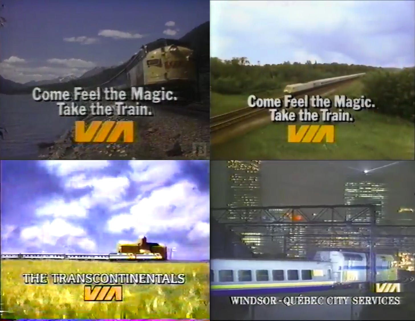
Even in the 1960’s CN was starting to make a distinction between its urban and rural or long distance services. The Turbo Train project was sometimes referred to as the “Toronto - Montreal corridor experiment”. By the early 1980’s VIA was going to make that delineation even stronger as it began to use the term “Quebec City-Windsor corridor” in its an annual reports, and increasingly its advertising. For its corridor services it would launch VIA 1, its first class service which included lounges at most large or mid-sized stations. From this point on there would be a clear distinction between VIA’s corridor and non-corridor services, with leisure quickly fading away as a key market segment.
Up until at least the late 90’s, VIA would produce two versions of the same commercial. They would have the same music, same slogan, with the imagery changed to reflect either its corridor or transcontinental services. Images are screenshots from four VIA Rail commercials.
In 1982 VIA stations introduced signage that had been designed by Burton Kramer, a Canadian graphic designer best known for designing the ‘exploding pie’ CBC logo in 1972. And it was very good. Modern font, easy to decipher pictograms, all against the VIA blue background. Very few examples remain of it today (there are a few washroom signs in Toronto’s Union Station). But as can be seen below it was the kind of refined style and quality that you would expect from Kramer.
The Burton Kramer designed signage was one of the strongest efforts by VIA to create a modern identity. Almost all of it is now gone, and not only is photographic evidence of it limited, but very little of it has been preserved for rail or graphic design collections. Left image via author archives, and right image taken by the author.
While VIA had not yet built any new stations, it was attempting to reactivate old ones. In 1985 a renovation was completed on Gare du Palais in Quebec City. Not only did it bring passenger service directly back to the city centre, but it reopened one of the most beautiful train stations in Canada. In the early 80’s there were also active discussion to try to bring service back to downtown Edmonton. While VIA would take decades to fully lean into the urban image of passenger rail, there were clear attempts in the early years to do just that.
There was also a third VIA identity that revolved around its remote and rural services. These were rarely promoted, aside from the occasional ad for the Winnipeg to Churchill service. The state of the network for these services was even worse than it was in the corridor, or along the main lines taken by the transcontinental trains. Some lines were the same as they had been in the early 1900’s, and how maintained or dilapidated stations had become depended on the resources individual communities had to keep them up.
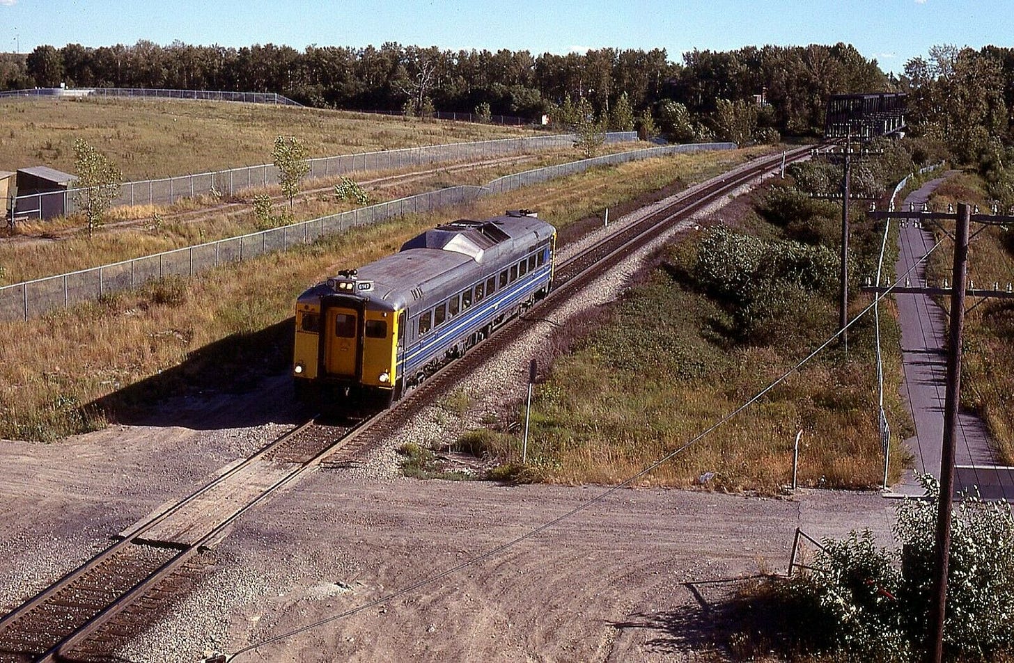
These services often used Budd RDC cars. Originally purchased in the late 50’s and early 60’s by CN and Canadian Pacific, they are self propelled diesel units. What this means is that there is no locomotive, each car has its own engine. They were purchased as a way to reduce costs on routes where ridership meant it was often difficult to fill up even a single car at times. Across the Prairies, Maritimes, and parts of BC and Northern Ontario, VIA deployed these extensively. Even on the Calgary to Edmonton route, which may instinctively seem like it would be a busy route, VIA was using RDC’s for a portion of the services on that line.
Just outside of Calgary, in the early 80’s, a lone RDC makes it way along the single track line. For many parts of Canada, ridership had declined to the point were a single RDC was the only way a service could avoid losing excessive amounts of money. Image via Trackside Treasures.
The VIA brand was starting to take shape, and it was looking to be a mix of long distance trains with a dash of romance, an urban transport system, and a much less publicized rural and remote service. But behind the scenes, it was a nightmare. The company was starting to hemorrhage money in a very serious way. Massive capital investments were going to be needed to carry out any kind of serious modernization campaigns. And passenger rail and public transport in general were losing to the car and air travel.
Maintaining a brand in an era of irrelevance
By the mid-80’s VIA’s brief flirtation with developing a strong design culture and modern service was over. Major cutbacks were on the horizon as the public began losing interest in taking passenger rail, or adequately funding it. VIA was going to be running on a shoe string budget and the marketing, and overall image of the agency, reflected it.
The generic, corporate image that had started with the LRC went into full swing. Ads were devoid of any joy. Sometimes they were a hot mess of text and images.
Two ads, 18 years apart, both trying to sell the same service, and even using a similar tactic to do so. But yet the difference between the two is night and day, with the CN ad being bright, vibrant, too the point, and very pleasing to the eyes, while the VIA ad was a hot mess. Left image from Macleans April 1967 issue and right image from 8 April 1985.
Towards the end of the 80’s VIA found itself having to replace LRC locomotives with big, boxy locomotives that looked like the were ready to haul crude oil or lumber instead of passengers. Not surprising images of the trains themselves largely disappeared from ads. Instead VIA relied heavily on hospitality, the train as a place to do work, and ‘the experience’ as opposed to the quality and convenience of the underlying service.
This was VIA’s advertising and brand identity in the late early and most of the 90’s. Exterior shots of the trains themselves got smaller, eventually disappearing completely for a while. It was all rather boring and forgettable. Left image from Macleans October 1989 issue, centre image from Macleans from May 1989 issue, right image from Macleans July 1989 issue.
The 90’s did not treat VIA any better. The company simply existed, not making any ground, but not losing any either in terms of ridership. No investments were being made in infrastructure, equipment, or stations. Its marketing and identity never once seem to deviate away from a mix of corporatism and bureaucracy. It had its niche market and there was no interest, or ability, to expand beyond it. A patronizing view of VIA in that decade would be “it did the best it could”.
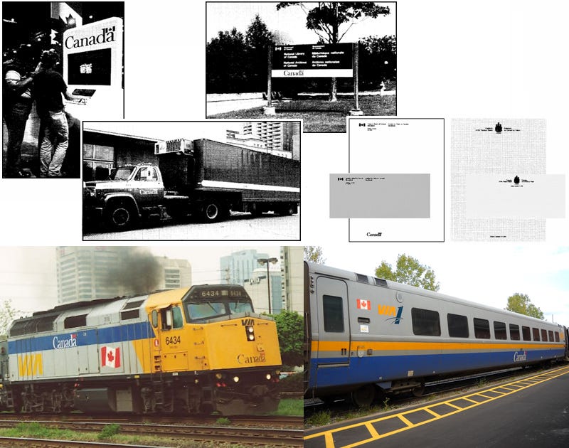
But that might be a kind interpretation. There were signs that when it came to its identity it was taking a slapdash approach, such as the case with the Canada wordmark. If you are not familiar with it by name, you have still undoubtably seen it. It is the “Canada” with the Canadian flag coming off the “d” that appears on signs, ads, government buildings, and most anything the government of Canada runs and operates. It came out of the Federal Identity program, a now iconic graphic design endeavour to provide consistency across all of the Federal governments various departments signs and communications.
At the top are various examples of the Canada wordmark in use, while the bottom shows the janky integration of the wordmark and variations of a Canadian flag, at varying sizes. Placement was based on where there was room, as opposed to perhaps making some slight modifications that could have better integrated it. Top image via Federal Identity Program Manual, bottom left image via High Ball Graphics, and bottom right image by Edward Brain via Wikipedia.
Initially VIA did not use this workmark. But by the end of the 80’s, it was starting to appear on trains, and eventually in print media as well. Little effort seems to have been given to find a way to integrate it into VIA’s existing liveries or design guidelines. On trains it was seemingly placed wherever there was room, at a variety of sizes that rarely fit within the rest of the livery design. By the end of the 1990’s the agency had eventually figured out a way, at least in print and corporate materials, to integrate the VIA logo and Canada woodmark in a way that is still used to this day. But it would take even longer before this same thoughtful approach was used in other aspects of its identity.
The method used to help integrate the Canada wordmark with the VIA logo, by having “VIA Rail” use the same font and placed before the wordmark, was a rather simple but effective strategy. This is still in use today. Image via VIA Rail Brand Guidelines.
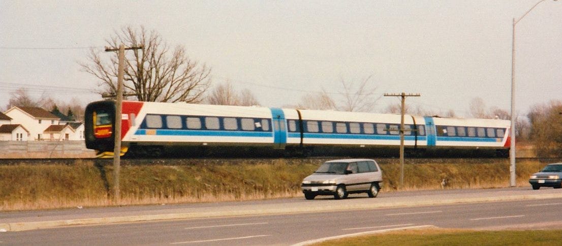
There was also an increasingly critical need for VIA to start replacing some its equipment, with some passenger cars well over 40 years old at that point. In September 1996 VIA began testing the danish built Adtranz IC3 Flexliner in the Quebec-Windsor corridor. It was a three car, self propelled unit, with a very strange, flat, rubber bumper protected profile on both ends, where drivers would control the train from. They were even briefly used to carry passengers but the trains didn’t meet VIA’s expectations and the two test units were returned.
The Adtranz IC3 Flexliner as it rolls through Kingston, ON. Two units were on loan from the Israeli Railways which is why the livery, aside from a few VIA logo’s added, does not have the standard brand identity. Image via Trackside Treasures.
Eventually VIA purchase 136 carriages that were no longer needed after a planned overnight service through the new Channel tunnel link between Paris and London was abandoned. This equipment had many challenges, of which accessibility was its biggest. But they were cheap, $160 million for the coaches versus an estimated $400-$500 million through the normal ordering process. And they were already built, so they could be put into service much faster, after a quick stop in Thunder Bay to do any retrofits needed to meet Canadian standards.
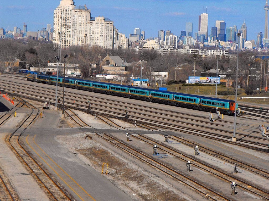
One of the biggest differences between the passenger cars, which would be known as the Renaissance fleet, and the existing equipment was the colour and design of the livery. These were not colours VIA had used up to this point. This choice had nothing to do with an evolution of the brand identity. This is how the coaches were already painted when they were delivered to VIA and because the paint was still under warranty, they opted to simply add a yellow strip, the necessary VIA logos, and leave it at that. Subsequentially, VIA would try to adapt some of its other media to incorporate the turquoise colour palette that was part of the Renaissance livery which would further contribute to the VIA brand becoming a hodgepodge of conflicting identities.
When you see the Renaissance fleet from a distance, when all you can make out is the shape and colours, it becomes rather apparent that this was a train meant to be run by a British rail company. Image by Buddha via Wikipedia.
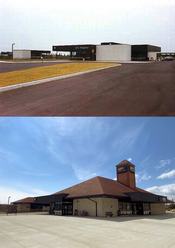
It didn’t look great for VIA going into the 2000’s. The agency was going to start renovating long neglected station. This sometimes resulted in absolute mess, such as the once proud Kingston Station. After almost 3 decades it was in need of work to get it back to a state of good repairs. With no eye towards the buildings original design a peaked roof and cupola were slapped on top, instead of a proper repair to the existing flat roof. It was a first rate hatchet job.
The CN built Kingston Station, shown in the top photo just after opening in 1974, was one of the very last stations the company built. It was also a rather charming modern design which may have only been used for two stations, the second being Saint John, NB. The bottom photo really speaks for itself. Top image taken by Massey F. Jones via Your Railway Pictures. Top image taken by the author.
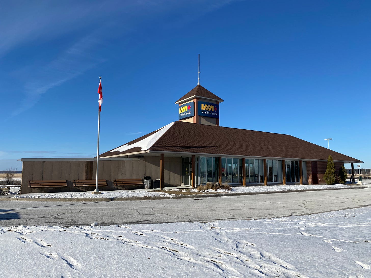
In 2002 VIA opened the first all new station on its network since they began operation. Fallowfield Station, which was at the northern edge of Barrhaven, a fast growing satellite suburb in Ottawa, was a chance to show what a modern station could be like, even if it was small. Instead, VIA built a slightly updated throwback to the small town train stations of the early 1900’s. It wasn’t horrible, it served the purpose of being a place to wait for the train, but it also wasn’t great. And at least they used brick, so at least there was that.
Perhaps the biggest upside to Fallowfield Station is that it has become so heavily used that it is often times inadequate for the number of passengers using and will likely need to be replaced in the near future. Image taken by the author.
As much as Fallowfield represented the overall floundering of VIA’s identity, it was also a sign of some of the positive changes that were starting to emerge. In part due to an emerging high tech sector, growing government departments, and a high quality of life, Ottawa was becoming one of the fastest growing cities in Canada. Since VIA service began there had only been one train station for the whole city. But the western satellite suburbs of Barrhaven, Kanata and Stittsville were not exactly close to it. Fallowfield was built to better serve these communities, a sign that VIA actually did care about finding ways to grow its customer base. It paid off with Fallowfield being the 8th busiest station in the Quebec-Windsor corridor by 2019.
In fact if the only ridership growth Ottawa had seen from 2001 - 19 was from Fallowfield station then it would have still seen ridership rise by 39%. But when you factor in the growth that the city’s main station also saw, ridership grew by 142%. As strange as it might sound, since it is the nations capital, Ottawa was actually a city that had been somewhat neglected by rail service, so it had growth potential for a long time. When VIA took over service in 1977, there were only 2 day time trip times between Ottawa and Toronto, and that was actually an improvement over the 1960’s when there was only 1 trip a day, during the daytime, which took 7 hours and 40 minutes. The often sleepy town of Ottawa, and its overlooked modernist temple, were shaping up to be a key part of VIA’s emerging identity in the subsequent years.
After the 90’s saw ridership numbers remaining flat, and despite increasingly old equipment and a tired, lacklustre image, the 2000’s were going to see more people using VIA’s trains particularly in the corridor. With a small amount of momentum building in VIA’s favour they needed to find a way to capitalize on it, which they did in 2003
A More Human Way to Travel
Sometime in 2003 (an exact date could not be found) VIA hired the Montreal wing of ad-agency Ogilvy to handle its marketing and advertising (excluding the VIA preference program). This was a global, internationally renowned organization who’s clients have included heavyweights like American Express and IBM.
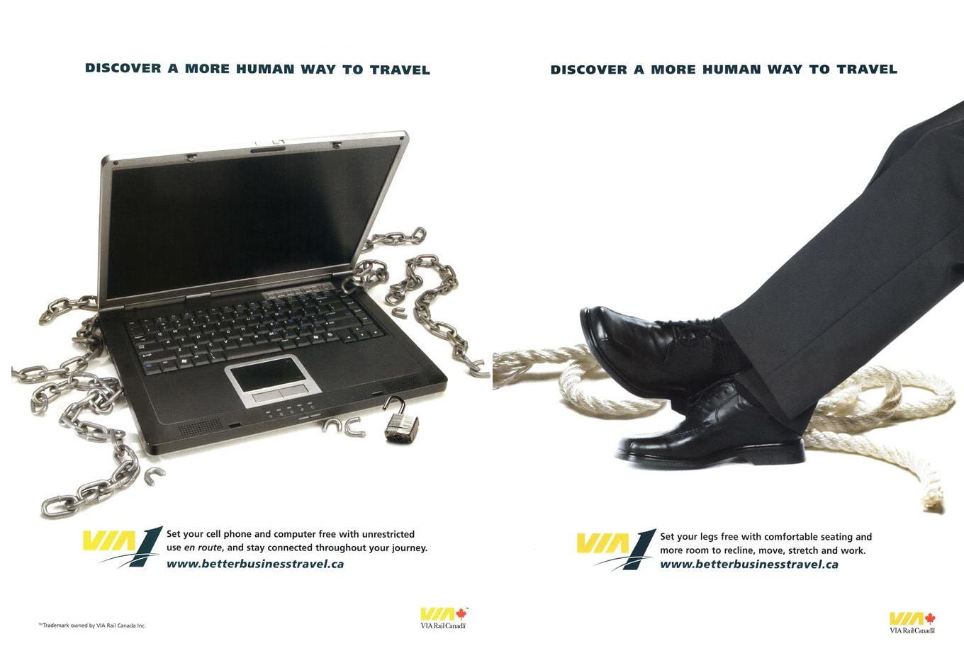
By the fall of 2004 the ads being produced were a vast improvement. They were simpler, easier to read, and a bit more creative. They no longer looked like the had been produced on a home desktop computer with a pirated version of Adobe software. And in that first series of ads there was a tag line…Discover A More Human Way To Travel…that was going to spark a turning point.
Two ads created by Ogilvy, perhaps the first instance in which a variation of the A More Human Way To Travel slogan appeared. Left image via Macleans 11 October 2004 issue and right image via 20 September 2004.
It is important to remember the context of this time. After September 11 airport security had degraded the experience of flying, requiring additional security checks, and a lot more time in the airport before the flight actually departed. Traffic congestion, always an issue in major cities, was seemingly getting worse as decades of suburban growth was taxing roadways in a major way. And there was a growing number of people who wanted an urban lifestyle and were moving to major cities. It was the perfect moment for an alternative to come in and take advantage of people’s discontent with flying and driving.
By the fall of 2005 the “A More Human Way To Travel” campaign was in full swing. The ads were focused on people, be they working, reading, or talking with someone, as they took their train trip. There was one picture, limited text, and a black background that made the VIA logo stand out even at a modest size. The message was clear; train travel is lovely and dignified compared to other options, without actually slagging off those other modes directly. It was subtweeting before Twitter.
The “A More Human Way To Travel” campaign would really help redefine VIA’s faded image. The messaging was simple, concise and it arguably VIA’s most memorable ad campaign. Image from Macleans 10 October 2005 issue.
It was hugely successful. It entered the Canadian zeitgeist and was even parodied on an episode of the Rick Mercer Report on 22 November 2005. It was the marketing win that VIA desperately needed and still remains one of their most iconic ad campaigns to date.
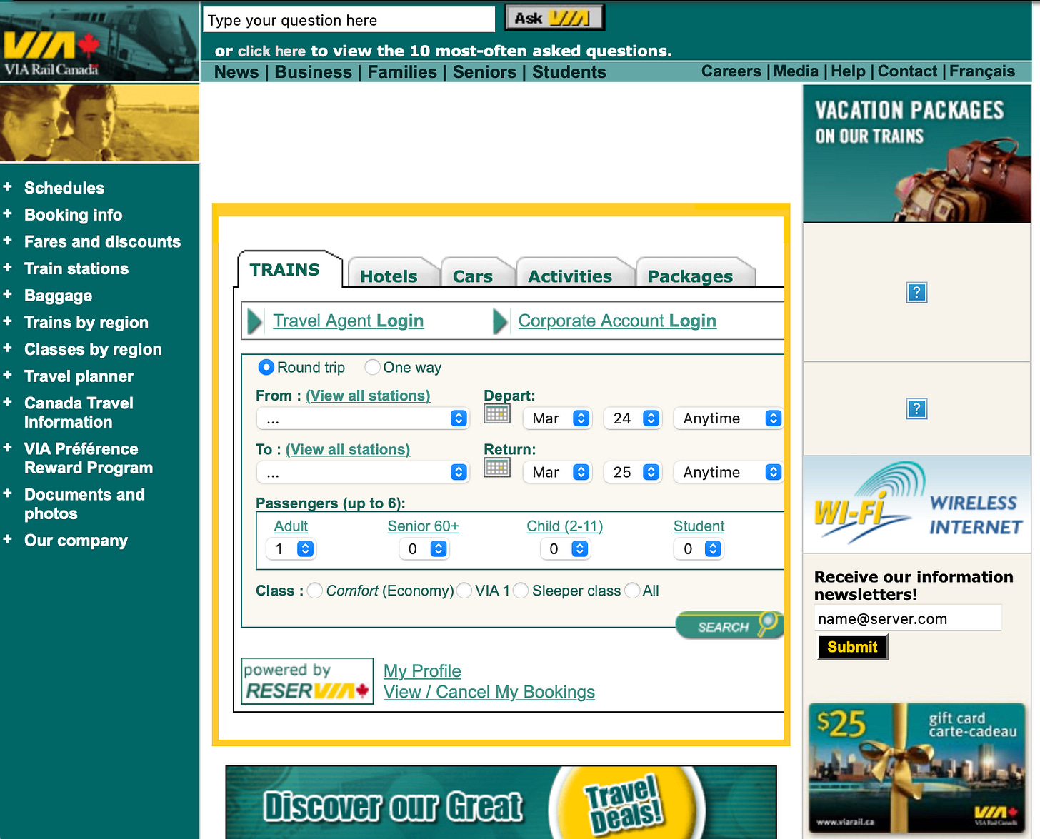
When it came to the rest of the company’s identity, it was still a mess. VIA had continued to incorporate the turquoise colour of the Renaissance cars into its broader brand identity. But it wasn’t across the board. Its website and other digital media, places where the cost of changing the was negligible, were updated. And some of its newly acquired locomotives were also painted with a turquoise variant of their livery. But when it came to station signage, and even print media, the new colours were rarely, if ever seen.
The VIA Rail website would find a way to make almost every element turquoise, even if it didn’t make sense and made the site harder to read and navigate. Image capture from June 2007 on Wayback Machine.
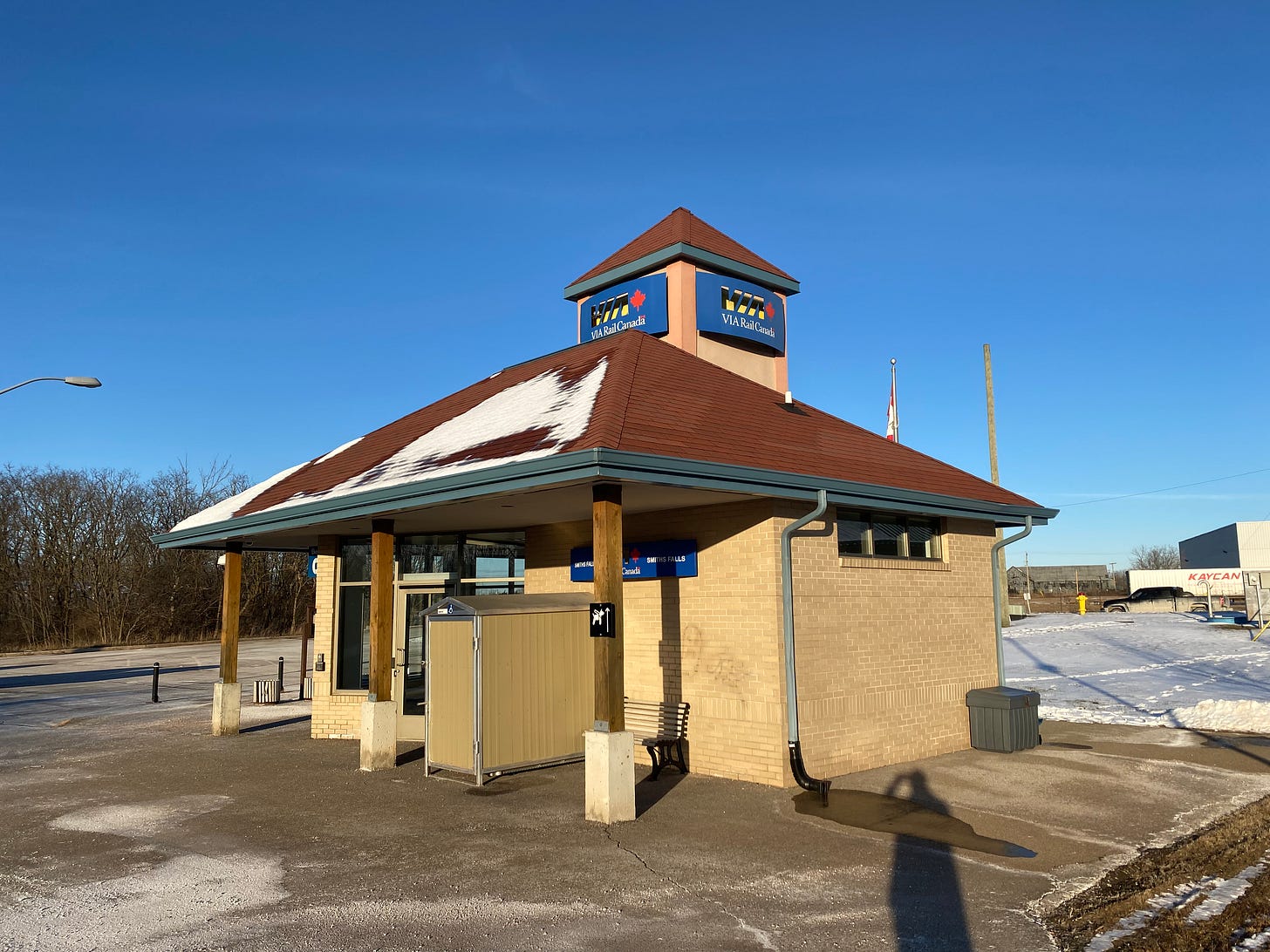
Its station design was still less than great. A new station in Smiths Falls that would open in 2011 was still adhering to the traditional, red shingled roof with a stucco cupola style that had started with Fallowfield station. Although in fairness to VIA Smith Falls, which is a rural Ontario town, is perhaps the one place in which this style was appropriate, even if it wasn’t particularly well executed.
The new station in Smith Falls, needed due to the platforms being relocated, was little more than a public washroom with some seating and a television screen to show departure and arrival times. Functionally it serves its purpose and it probably wouldn’t look all that bad if more care had been given to make the cupola match the rest of the building. Image taken by the author.
In 2008 Palm + Havas would become the new ad-agency for VIA. Their work would largely build upon what had been done in the previous 5 years. The “A More Human Way To Travel” campaign would continue up until 2012, as would the focus on people and the experience of travelling by train. Perhaps the pinnacle of their work was a commercial simply titled “Windows”. It was clever, charming, and clearly aimed at the suburban market with a lifestyle brand kind of vibe about it.
In 2010 a VIA commercial titled “Windows” was released, and even received some critical acclaim. Originally created by Palm + Havas and published on YouTube.
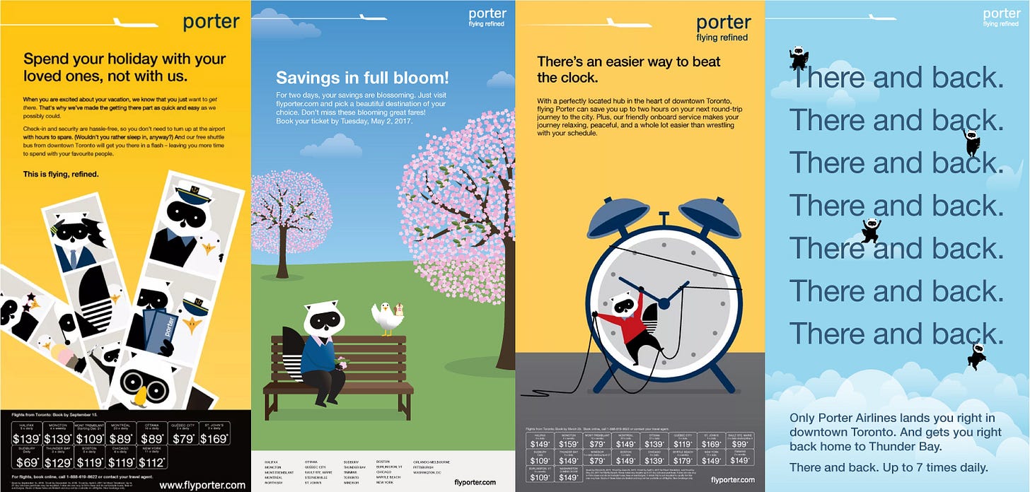
While VIA’s marketing wasn’t degrading to the level it was in the 80’s and 90’s, it had definitely stalled. While existing campaigns were being stretched to the limit, you had Porter Airlines, lead by Winkreative, showing how to be a globally celebrated marketing darling. Their racoon mascot, consistent branding, whimsical illustrations, and focus on dedicated waiting areas for all passengers that were somewhere in between a traditional airport terminal and first class lounge, all contributed to Porter’s success.
Porter showed every transportation company in Canada, not just VIA Rail, how to build an instantly recognizable and beloved brand. Images via Rachel Wilmshurst Design and Winkreative.
And it made Porter an easy target for copycats hoping to reproduce that same magic. There were some ads that were produced for VIA which made mediocre attempts to replicate this style, but it never caught on and never became central to its marketing and identity.
VIA was not the only company who tried to mimic the “cartoony” aesthetic of Porter. They were also not the only ones who did a bad job of it. This marketing campaign never really caught on, and it is now nearly impossible to find evidence of it. Image via Kingstonist.com.
One of Palm’s longstanding contributions was the further delineation between corridor and long distance services. While at times marketing for the two types of travel had looked similar and would simply use different imagery depending on the service, Palm created a completely different look and identity for The Canadian and The Ocean train services. While the corridor ads focused on people, getting work done, relaxing, the long distance services put the natural landscape front and centre, with people playing the secondary role.
No trains. No people. Just mountains. Even though the Canadian could be a relatively posh experience if you paid for the first class experience, the essence of the train was increasingly being distilled down to the scenery you saw from it above everything else. Image via Macleans March 2013 issue.
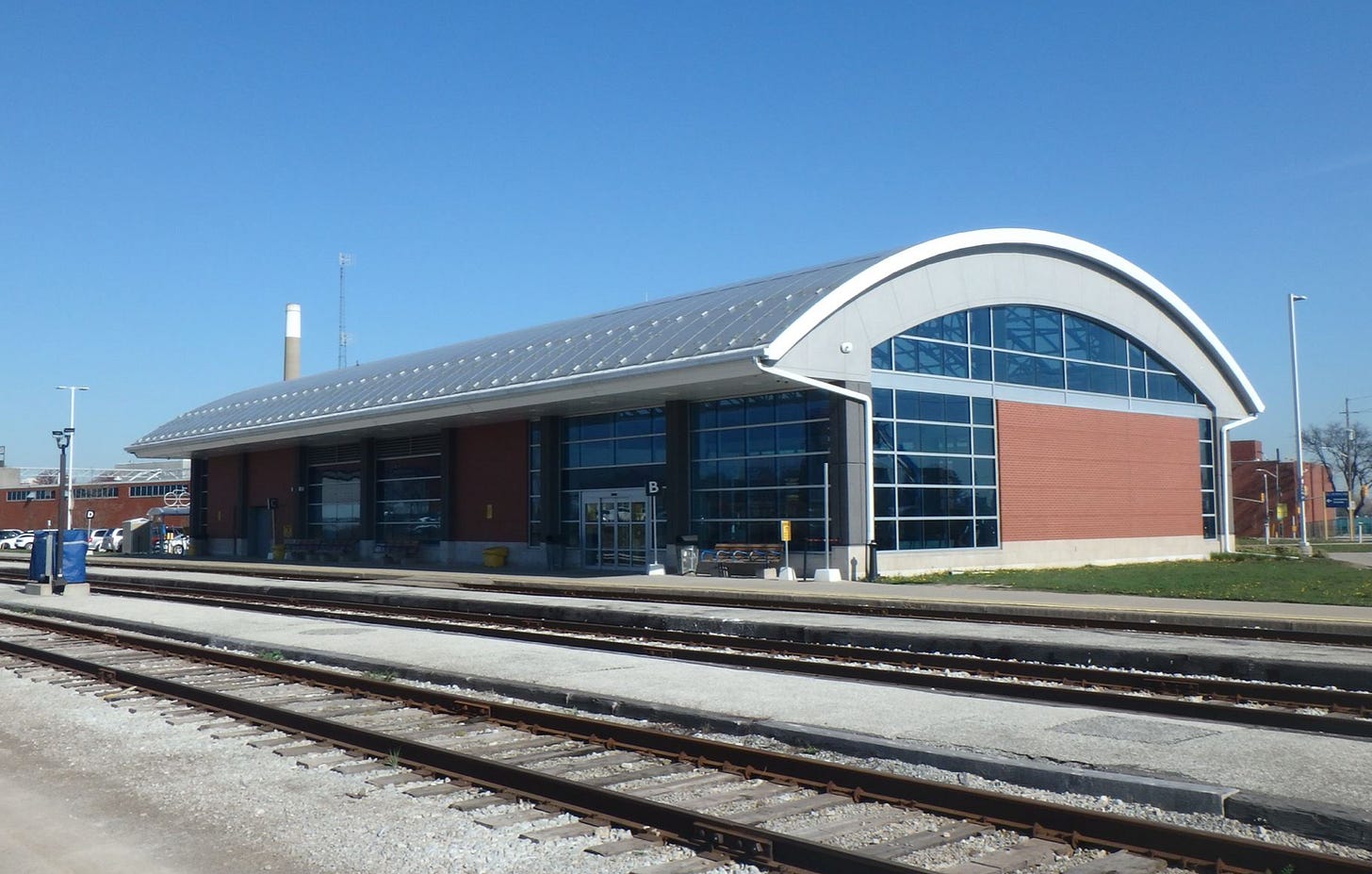
In 2012 VIA was starting thinking outside the box and built a new station that did not have a peaked roof. Windsor’s new station was a rather confusing style. It more closely resembled what a fancy curling arena might look like rather than a train station. But that was fine. It had a glass ceiling which allowed light to pour into the waiting room. There were large windows looking out on the platform, and it was just an all round cozy place to wait for a train. It was far from perfect, but it was progress.
The new station in Windsor, ON, is reasonably spacious, and the waiting area receives a lot of natural light. But it is an odd looking building, and probably for the best that it was the only time VIA attempted this style of station. Image via Waymarking
That same year, on the other side of Toronto, a new station opened up in Belleville which was the first station built in the 2000’s that didn’t look like it was designed in the 1980’s. Finally VIA had built a station that did not feel like a throwback. It had lots of light, and a reasonably spacious waiting away, for that city. It would never grace the pages of an architectural magazine. But it was good. And as a bonus they also kept the old limestone station which has is currently being used by Firefighter Without Borders.
The new Belleville Station, completed in 2012. It does not look like a VIA station, and that is what makes it an important step forward. Image via J.J.McGuire
By 2013 VIA was facing some challenges, such as declining travel market due to the financial crisis of 2008, and a round of small cutbacks. But they also had some success in gaining funding for a collection of small capital projects, purchasing part of a rail corridor, and other smaller improvements it was attempting to make to its service. But, for the first time since the early 80’s, there were some signs that the agency as a whole to make a substantial shift to a more modern, forward thinking vision of what the service could be.
Cossette
While the two previous ad agencies had helped move VIA marketing and branding in a positive direction for the first time in decades, the role Cossette was about to play would eclipse them both by a long shot.
Their arrival was serendipitous timing. VIA announced they had signed Cossette to take over VIA’s main account on 29 November 2013, after years of them handling their Preference rewards program. While VIA had operated a website for around 14 years at that point they were lagging in the constantly evolving digital landscape which now included social media, targeted advertising, smart phones, and all kinds of new ways to reach out to potential customers.
It was also set to coincide with VIA’s first serious attempt at modernizing its passenger rail services. Cossette’s success with its marketing campaigns were in turn going to make this push by VIA a lot easier. That was still a few years away, which gave Cossette plenty of time to flex its creative muscles.
When it came to traditional media, that being print ads, commercials, and static billboards, they would still not be able to produce anything as popular as the “A More Human Way To Travel” campaign. But there were some solid efforts. One mini campaign called “Visit Your Parents” targeted students and used colourful, pixelated illustrations against a black background for a simple a straight-forward communication style. The student market has become increasingly important to VIA. The cheap fares generate a fraction of the revenue that VIA 1 passengers do, but it is a small trade off for hopefully converting many of them into long term, full fare customers once they finish school.
The “Visit Your Parents” campaign was simple, but effective. It directly targeted students, which is a market that has become important to VIA’s existing and future ridership. Image via AdForum.
There were also the dozen or so commercial that were part of the “Why Don’t You Take The Train” campaign. Targeted at twenty-something urbanites, business travellers, an middle-aged suburbanites the commercials were 15 seconds long, which was an ideal length to appear before a YouTube video, as well as on television.
But it is was in the digital space that Cossette would shine. It went well beyond simply making images of the current campaigns that could be displayed as web banners. They bought ad space on Google’s search engine based on weather conditions, targeting those people looking up travel information on stormy days. They used electronic outdoor billboards to display real-time driving estimates against the slogan “Why Don’t You Take The Train”. And they used geo-location data of drivers stuck in traffic to serve targeted ads for VIA after they arrived home, or at their final destination. It was a highly sophisticated campaign, which the video below, explains in much more detail.
A video produced by Touche, who partner with Cossette on the digital media campaigns, that explains how one of their digital campaigns works. It is a highly sophisticated form of marketing that relies heavily on real time data. Video produced by Touche and published on Vimeo.
Their efforts paid off. From 2015 onward VIA was seeing its strongest ridership increases since the early years of the agency. Cossette would continue its digital strategy by moving to 6 second commercials specifically designed for YouTube, or even as a dynamic ad on a webpage in place of a static image. While VIA typically had bilingual versions of its ad campaigns that were differentiated only by the language of the text (or the actors in the case of commercials), there were also some region specific commercials that aired only in French markets. Cossette was making sure that as the marketing landscape became increasingly about hyper-targeting demographics, VIA would not be left behind in this regard.
While the commercial is nothing particularly special, it is a good example of the increasingly targeted marketing that was taking place, not just in the digital landscape, but even among traditional media. Video produced by Cossette and published on YouTube.
Despite the fact that no single ad campaign made it into popular Canadian culture, the culmination of Cossette’s work had nonetheless resulted in the most successful marketing campaign in VIA’s history when measured by increases in ridership. But there were still serious problems with the rest of VIA’s identity and brand.
The early years of VIA’s modernization
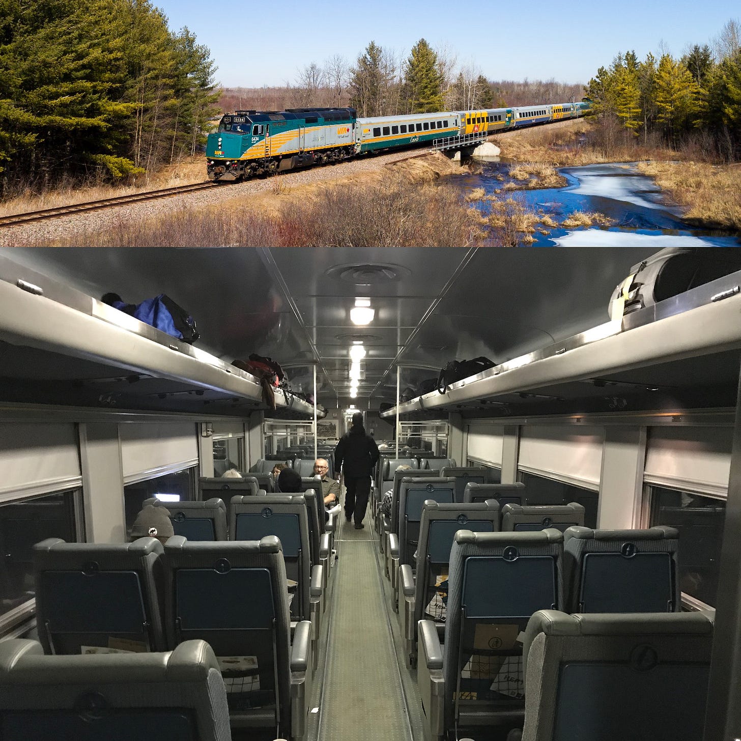
By the the mid-2010’s VIA’s trains looked worse than ever, and its on time performance was declining. More people were using the service but in some regards they were going backwards. In the corridor they found themselves relying on equipment that was almost 70 years old at that point in order to provide service.
The top image is directly from VIA Rail’s Twitter account and used as their banner image. The hodgepodge of liveries and the boxy diesel locomotive is literally the best looking train in their current fleet that they could come up with. The bottom image shows the interior of one of the 70 year old passenger cars being used today. This would be fine in a museum and a tourist rail operation, but is absolutely tragic in the context of a revenue service in the 2020’s. Top image from VIA Rail Twitter account. Bottom image taken by the author.
The harsh reality for VIA was that even with sophisticated marketing, the odd new station, and some redesigned VIA 1 lounges, its identity and brand was always going to showcase a different reality once people actually set foot on the trains. Even the header image on VIA Rails Twitter account, where they have every resource and reason to put their best foot forward, shows an admittedly colourful, but highly mismatched and dated train.
In 2015 VIA began publicly talking about what it was calling the High Frequency Rail, or HFR, project. It would reactive old rail corridors between Toronto and Ottawa, and Montreal and Quebec City on the north shore of the St Lawrence, as well as utilize a few of the corridors leading in and out of Ottawa that it already owned. It would bring service back to Peterborough and Trois Rivieres. But it would, first and foremost, be dedicated to VIA trains, meaning no freight traffic to contend with. It was not about being a super fast high speed rail system. It was about reasonably fast speeds, reliability, and frequency.
By this point it was almost a joke every time a ‘new’ high speed, or modern rail system proposal was released in Canada. While there are many reasons why previous ones had failed, it was a point of derision and mockery every a new one was published. Even the Rick Mercer Report in October 2011 made a short sketch about the “High Speed Rail Study Industry”. So it wasn’t too surprising that the early years of the HFR proposal largely saw people dismissing the project.
For reasons well beyond the scope of this article, this proposal was different from anything that had come before it. So instead of simply being placed on a dusty shelves in Canada’s National Archives, it remained alive and active as public support for the project was drummed up. This would be the kind of project that VIA needed.
In 2017 and parts of 2018 VIA celebrated its 40 year anniversary. This was going to be a weird time for the agency. It didn’t have a lot to celebrate and the marketing for the occasion was fairly uninteresting and uninspired. Instead, VIA seemed to be focused on the future. In April 2018 it released a video which was akin to a 30 second manifesto with the line “At 40, VIA Rail is transforming” followed by a shot of an actual modern looking train heading into a city.
Titled “The Future Is On Board” this commercial was really VIA telling the public it was looking towards the future, and ready to change what VIA had been up until that point. Produced by Cossette, with CGI created by RodeoFX, and published to YouTube.
At the time there was every reason for someone to think that video was bullshit. This was VIA after all. Their track record was pretty poor on bringing modernization campaigns to life, along with the decades long lack of public support for funding. But as is often the case there was a lot going on behind the scenes, and in October 2018, the plot was going to be slowly revealed.
Love The Way
On the surface the “Love The Way” campaign appears to be just that, another new marketing campaign, albeit a major one. It adopted a very distinctive style from the start. Colours were bright and vibrant. The VIA logo was often front and centre, and even played a part in some of the ads. All traditional and digital media campaigns were going to be rebooted under this new identity. It had a much more urban feeling than any previous marketing, particularly in its television, YouTube, and cinema commercials. It wasn’t just shots of skylines. It was streetscapes, streetcars, subways, bike paths. And Ottawa Station was being featured as its default station backdrop. VIA was clearly trying to put forward the most modern image it could, given its assets in late 2018.
The “Love The Way” marketing was a drastic improvement, even if it hasn’t become a sensation in the same way Porter was in the late 00’s, or is as iconic as CN in the 1960’s. But it didn’t need to be because it was about a broader campaign to rebuild the VIA identity, where the trains and the quality of service could eventually one day be front and centre. Left image via VIA Rail 2018 Annual Report, right image via VIA Rail Brand Guidelines.
But the marketing was only the beginning. For the launch of the campaign VIA released a brand guidelines manual, outlining in detail exactly how its logo and other aspects of VIA’s image should be used. Not only did its strange run with the turquoise colour palette come to an end, it also dropped the VIA blue colour, a staple since 1977. In short the campaign was a fully coordinated, top to bottom overhaul of its entire brand and identity. It may even have been a more thoroughly coordinated effort than when VIA originally started.
VIA yellow remained, while the turquoise and VIA blue did not. Directly from the VIA Rail Brand Guidelines, this shows the full range of the new VIA colour palette. Image via VIA Rail Brand Guidelines.
The timing of this rebranding and campaign launch was critical. On 12 December 2018, VIA Rail announced that it had purchased 32 all new train sets from Siemens. At $989 million it was the single biggest investment in not just equipment, but any aspect of VIA’s operations to date. Everything about the trains, other than not being electric, was going to be modern. The livery would be in the new yellow, black and grey VIA colour scheme. They would be fully accessible and even allow for some bikes to be brought directly on the train. And for the first time since the LRC era ended, the trains themselves were going to once again be featured, instead of hidden.
VIA produced this video, distributed through YouTube and other online channels, as part of its announcement that the purchase of an all new fleet for the corridor was complete. Going forward, VIA would continue to make regular announcements about this project a key part of its social media marketing. Video produced by VIA and published to YouTube.
On 25 June 2019, the federal government announced that VIA would be receiving $71 million in funding to start developing its HFR proposal. Unlike past modernized intercity rail studies, this one was much better funded, and would allow VIA to ultimately move into a procurement phase following that. While this was unsurprisingly still being treated with some skepticism, VIA itself was going to do something it had never done and start actively promoting expansion plans.
In November 2019 VIA released a video on its YouTube page that outlined the proposal. Around that same time it also started placing posters and banners around a number of its stations promoting the HFR proposal, new VIA 1 lounges, and the new corridor trains. Every aspect of the promos incorporated the new brand guidelines, and was wrapped in the “Love The Way” slogan.
During renovation work at Ottawa Station in 2020 VIA covered the hoarding with an array of advertisements for its various modernization campaigns. Images from Ottawa station taken by the author.
At the start of 2020 things were looking up for VIA. 2019 had seen its ridership in the corridor increase 5.4%. Some of the biggest challenges facing the agency were trains being sold out on busy weekends and not being able to take advantage of all the demand. But then the pandemic hit and as with every other agency it was going to be survival mode for a while. That didn’t mean halting the long term plans of the “Love The Way” campaign. But it would be slightly deflating to the momentum the VIA had going. Instead of clever marketing campaigns, it was going to be public service ads about health and safety procedures for a while.
VIA’s identity would still continue to evolve despite all that. In Fall 2021, the first of its 32 new train sets was delivered to Montreal. While there had been renderings and lots of promotion for them, having one actually delivered, that could be photographed and seen, was a critical step forward for the agency. Not only was the train itself the most modern piece of equipment VIA had seen in 40 years, the livery was the best one VIA has ever had, and the best since CN’s in the 1960’s. VIA’s new colours were on full display, and finally, the VIA logo and Canada word mark appeared on the livery in a way that didn’t make it feel like an afterthought.
A view of VIA Rail’s new trains and its new livery. The locomotive end, and the cab car end each have a distinct, but coherent look (top two pictures). On the passenger cars the “VIA RAIL CANADA” in the top yellow bar is actually a throwback to passenger coaches of the pre World War 2 era, yet has been done in a way that it feels contemporary and not at all out of place. Top image from VIA Rail Canada via Railway Age, middle image from VIA Rail Canada via Reddit, and bottom image via Trackside Treasures.
In February 2022 a new commercial, alongside a new mini campaign, called Book Your Comeback was released. Its premise was simple…everyone had put their life on pause for the past 2 years, highlighted by the slow motion shots, and that it was now time to move again. Mostly in black and white, filmed on the platforms of Ottawa Station, it was the kind of sophisticated, well styled commercial that seemed more suited for a European rail service instead of VIA. Had it been filmed later this year, once at least a few of VIA’s new trains were in service and could be used in the commercial instead of the rubbish fleet it featured, it would have been perfect.
“Book Your Comeback” was a commercial designed to poke at your emotions, and also conveyed a modern image of VIA, in part by using Ottawa Station as a backdrop. It offers a positive look at where the agency could be headed in the coming years. Produced by Cossette and published on YouTube.
45 years in, VIA finally gets a chance to build an identity from the ground up
VIA came into existence at perhaps the worst possible time. Not only had passenger rail ridership been declining, but growing suburbanization in Canada meant that the public support needed to modernize the agencies network and equipment was never in the cards. It seems as though genuine efforts were made in the early years to develop a modern brand based on modern technology. But building an identity based on a mode of travel that was rapidly falling out of favour is an enormous task, even for the very best designers and marketers.
Over its first 4 decades VIA would still manage to establish itself within Canadian culture. But that image hasn’t always been positive, and when it was it was often rooted in nostalgia more than the reality of the service today. VIA became a part of Canadian identity by default more than anything else.
But Canada is not the same country that it was when VIA was founded. Cities are becoming more urban people continue to flock to that lifestyle. And with that has come investments in public transport. For the first time in its history, real money is being poured into intercity passenger rail, a move that is becoming more widely supported by the public. In 2022 VIA will start to use its new, modern trains, the procurement phase of HFR started just a few weeks ago, and by the end of the year an order could be completed to replace the remainder of VIA’s long distance and remote services train fleet.
VIA is still a ways away from being able to do a victory lap. It’s stations have gotten better, and it has done an excellent job renovating older ones. But it has yet to build great stations on its own. It is going to have some brilliant new trains. But the underlying infrastructure will still be rubbish for a while and it has yet to come up with a full modernization campaign for services outside of the corridor. VIA finally has a comprehensive, coherent brand identity emerging, with guidelines to establish it in all parts of their operations. But despite its much more refined image, it is still not yet on the same level as CN in the 1960’s.
Luckily VIA is looking less and less like VIA each day, and that is a great thing.
If you want to find me on social media you can do so @Johnnyrenton.bsky.social on Bluesky. If you have any thoughts or feedback let me know in the comments.

